Preview image. Unlock full-res
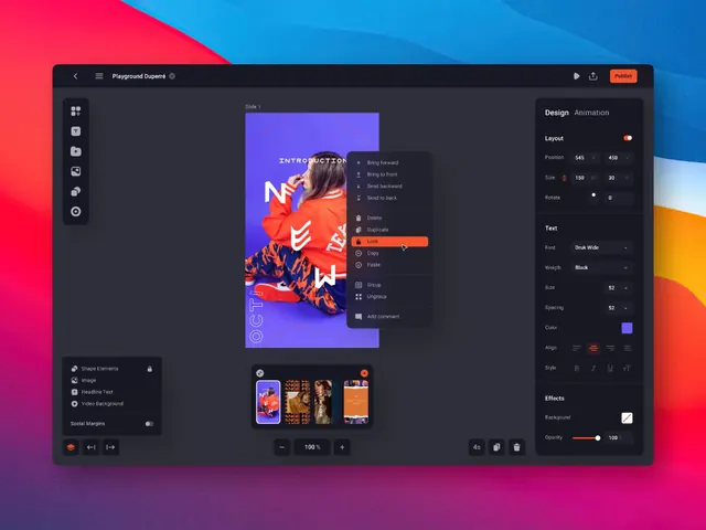
A dark-themed design editor interface is shown inside a desktop-style window with a colorful gradient background behind it.
Summary
A dark-themed design editor interface is shown inside a desktop-style window with a colorful gradient background behind it.
Visual description
The screen shows a dark UI editor with a top bar, a left vertical tool rail, a central canvas, a right properties panel, and a floating context menu over the canvas. A vivid pink-to-blue gradient background sits behind the application window, and the central artwork uses purple and orange tones.
Key takeaway
Use a dark, boxed application shell with high-contrast panels and a floating context menu to make a complex editor feel organized. The strong gradient backdrop gives the interface a more premium, attention-grabbing presentation.
Reuse notes
Reach for this pattern when showcasing creative tools, editors, or dashboard software that needs a polished demo feel. It works best when the interface itself is the product and the goal is to make controls feel dense but controlled.