Preview image. Unlock full-res
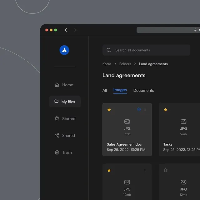
A dark-mode file management interface is shown inside a desktop window with a left navigation rail and a grid of document cards.
Summary
A dark-mode file management interface is shown inside a desktop window with a left navigation rail and a grid of document cards.
Visual description
The screen shows a dark desktop-style app window with rounded corners and macOS traffic-light controls in the top left. A vertical sidebar on the left contains an app icon and navigation items, while the main pane has a search bar, breadcrumb path, a large page title, tabs, and a grid of file cards. Some cards include star and upload icons plus file names and dates.
Key takeaway
Use a dark, high-contrast file-browser layout with a narrow navigation rail and a spacious content area. The combination of breadcrumb, title, tabs, and card grid creates fast orientation without visual clutter.
Reuse notes
Reach for this pattern when the product needs to organize lots of files or records and should feel efficient and premium. It works best when primary actions can live inside cards and the left rail can stay compact.