Preview image. Unlock full-res
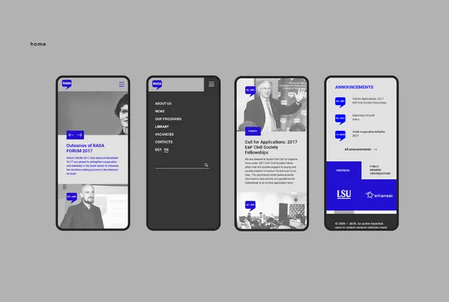
Four mobile app screens for a higher-education institution showing information architecture via dark navigation, list views, news content, and announcement callouts.
Summary
A mobile app UI system for a higher-education organization, displaying information architecture across a news listing, navigation drawer, detail article, and announcements section.
Visual description
Four iPhone mockups arranged horizontally show a cohesive design system. The leftmost screen features a news list with a bright blue pill badge ("NEWS"), headline text, and a small portrait photo. The second screen shows a full-height dark navigation drawer with menu options (ABOUT US, NEWS, OUR PROGRAMS, LIBRARY, VACANCIES, CONTACTS, etc.). The third screen displays a full-width article with a headline ("Call for Applications: 2017 Fall Colloquium Fellowships"), byline, and body text over a grayscale photograph. The rightmost screen is a light-background announcements panel with a vertical stack of blue pill badges and text items, anchored by a footer logo lockup. Typography is clean sans-serif throughout; the color system relies on dark gray, white, and a bright institutional blue.
Key takeaway
Tight information hierarchy using pill badges as visual anchors (consistent color, shape, scale). The dark drawer nav creates a strong chrome that doesn't compete with content. Vertical rhythm in the announcements card (stacked items with breathing room) scales logically across screens.
Reuse notes
Strong reference for educational or institutional mobile apps. Works especially well when displaying news feeds, menu navigation, or stacked announcements. The blue accent is institutional and suggests authority; adapt the color for other verticals.