Preview image. Unlock full-res
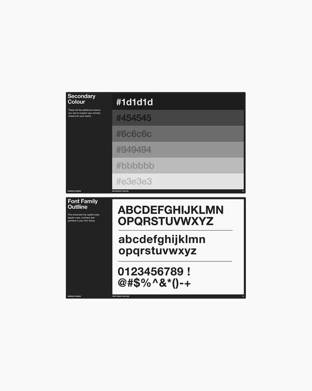
Two-part design documentation specimen showing a grayscale secondary color palette (five tonal steps) and a sans-serif font family with uppercase, lowercase, numerals, and special characters.
Summary
A two-panel design system reference documenting secondary color values in a five-step grayscale ramp and a complete sans-serif font family with case, numbers, and punctuation.
Visual description
Top panel (dark background, white text) shows "Secondary Colour" header with a label "SECONDARY COLOUR" bottom-right, displaying five color swatches as horizontal bands with hex values: #1d1d1d (darkest), #454545, #6c6c6c, #949494, #bbbbbb (lightest). Each swatch occupies equal height with the hex value displayed in light gray text overlaid or adjacent. Bottom panel (white background, black text) shows "Font Family Outline" header, displaying a sans-serif typeface specimen organized in three rows: uppercase alphabet (ABCDEFGHIJKLMNOPQRSTUVWXYZ), lowercase alphabet (abcdefghijklmnopqrstuvwxyz), numerals and special characters (0123456789 ! @#$%^&*()-+). Thin horizontal rules separate each row. Both panels carry a studio branding mark (STUDIO STUDIOS or similar) bottom-left.
Key takeaway
A tonal grayscale ramp (five discrete steps from dark to light with hex labels) provides a reusable secondary palette for interfaces that extend beyond primary brand colors. The horizontal swatch layout with values inline lets designers quickly reference and copy hex codes. A clean sans-serif specimen laid out row-by-row (uppercase, lowercase, numbers, symbols) documents the font's full character set and visual weight in one reference, avoiding the need to hunt for missing glyphs. The high-contrast black-on-white / white-on-black split tests readability in both modes.
Reuse notes
Save as a template for design system documentation, brand guides, or design-ops handoff. The tonal ramp structure works for any color (extend from primary, secondary, or neutral palette). The font specimen is essential when specifying a single typeface across teams; include weights (regular shown here) and styles (italic if available) in additional rows. Use this format in Figma or PDF design guides to ensure all team members have the correct hex and glyph reference. Works best printed 1:1 scale or displayed on screen at 100% zoom for accurate color perception.