Preview image. Unlock full-res
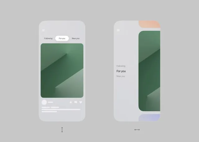
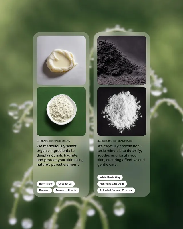
A side-by-side mobile UI comparison of two different organic skincare products, highlighting their distinct textures and ingredients.
Typesans-serif, condensed
Industryconsumer-app, ecommerce
Tagsskincare, comparison, organic, app-design, beauty
Palette
#455439
#D1D0CB
#959C80
#A7A7A8
Summary
A side-by-side mobile UI comparison of two different organic skincare products, highlighting their distinct textures and ingredients.
Visual description
Two vertical mobile screens display product images with circular ingredient highlights. The left side features a light, creamy texture with green accents, while the right side shows a dark, grainy texture with white accents.
Key takeaway
Uses a clean, symmetrical layout to effectively contrast product attributes and visual textures.
Reuse notes
Apply this side-by-side comparison layout for any product feature highlights or 'before and after' scenarios.