Preview image. Unlock full-res
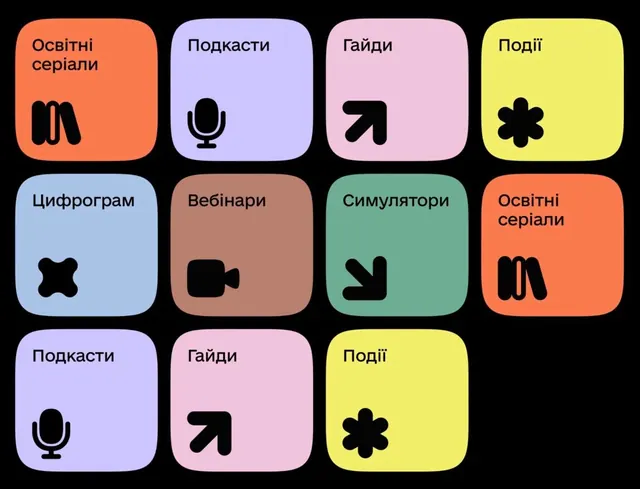
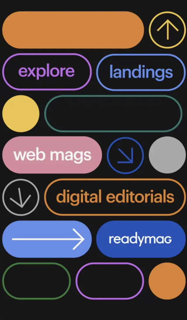
Navigation menu using rounded pills and buttons in warm and cool tones (orange, purple, blue, green, pink, gray) with centered icons to organize content sections.
Summary
Navigation menu with a vertical stack of colored, rounded pill buttons and circles on dark background, each labeled with text or directional icons to navigate content categories.
Visual description
Against a dark charcoal background, a vertical stack of UI elements: an orange rounded pill at the top with an up-arrow icon in a circle, then pairs of medium-sized pill buttons in alternating rows. "explore" and "landings" sit side by side in purple and blue outlines. A yellow circle occupies one slot; "web mags" and a dark circle with a down arrow occupy the next row. "digital editorials" spans a wide orange pill with a down arrow. A blue pill with a right-pointing arrow labeled "reedymag" comes next. The bottom rows show partially visible additional buttons in green and purple outlines, plus an orange circle. All buttons use rounded corners and centered icons (arrows pointing in cardinal directions).
Key takeaway
The color-coded navigation system uses distinct hues to differentiate sections intuitively, reducing cognitive load. Rounded pill shapes and large, centered icons create generous tap targets and a friendly, inviting feel. The mix of text labels and icon-only buttons keeps density in check while maximizing visual clarity on smaller viewports.
Reuse notes
Effective for media apps, content libraries, or publishing platforms where users browse multiple content types (galleries, articles, editorials). Works best when categories are mutually exclusive and directional icons reinforce hierarchical navigation. The warm-and-cool color mix feels approachable rather than corporate, so it fits consumer-facing publishing more than internal tools.