Preview image. Unlock full-res
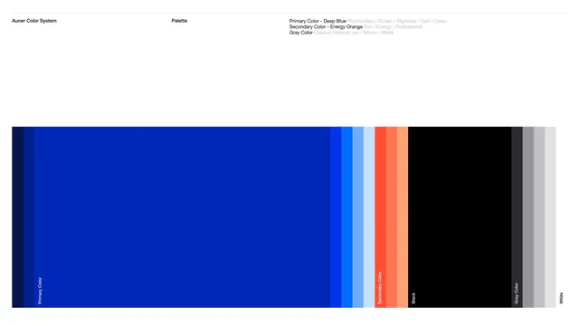
A corporate color palette specimen showing primary deep blue tint-shade progression, secondary energy orange, and grayscale neutrals with brand narrative descriptors.
Summary
An Auner brand identity palette showing a complete system centered on photovoltaic deep blue as primary, with secondary energy orange, grayscale neutrals, and brand philosophy labels for each color family.
Visual description
Horizontal color bar divided into four major sections. Leftmost is a deep blue tint progression from navy to sky blue (labeled Primary Color, with descriptors Photovoltaic / Ocean / Rigorous / Vast / Clean). Center-left transitions to a lighter blue band. Center-right shows bright energy orange with two shades (labeled Secondary Color, Sun / Energy / Professional). Rightmost contains black to light gray gradient (labeled Gray Color, with descriptors Black / Dark Gray / Light Gray / White). Text header identifies this as the Auner Color System with subsection labeled Palette.
Key takeaway
The metadata-rich labeling (adding emotional or technical narrative to each color family) helps teams use the palette consistently. The tint-shade progression for primary and secondary colors provides both on-brand vibrancy and accessible lighter alternates for text and backgrounds. The neutral gray band ensures a complete, production-ready palette.
Reuse notes
Ideal as a template for corporate or B2B brand guidelines. The philosophy statements help designers understand when to reach for each color. Works across digital and print applications where consistent, authoritative color is essential.
More like this





Keep what you find
A free account saves references to boards and can send you a weekly email of picks based on what you save.
To see every result, go Pro.