Preview image. Unlock full-res
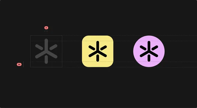
A design system demonstrating icon state transitions with geometric asterisk symbols in grayscale, yellow rounded square, and magenta circle, showing component specifications and layout guides.
Summary
A design system specification sheet showing three icon states of the same asterisk symbol in grayscale, yellow rounded-square, and magenta circle containers, with dashed alignment guides and annotation markers.
Visual description
Dark background with three asterisk icons arranged horizontally on a center alignment line. First icon (grayscale, within a dashed border rectangle) shows the base state with gray symbol and reference markers labeled A and 2A in coral pills. Middle icon (bright yellow rounded square) emphasizes the active or highlight state with black asterisk. Third icon (bright magenta circle) demonstrates an alternative container shape in the same color family. Horizontal dashed grid lines and vertical guides frame each element, suggesting a design-system specification template for component developers.
Key takeaway
The progression from grayscale default through active (yellow) and alternative (magenta) states shows how to document UI component behavior systematically. The grid-and-guide overlay gives production-ready specification precision. Using geometric containers around a unified symbol helps scale the system across different interaction states without redrawing the icon itself.
Reuse notes
Use as a reference for design-system documentation, especially for developer-facing icon libraries or component specifications. The color contrast between default and active states is high enough for accessibility. Works well in Figma or design-tool exports where layers and annotations can be preserved.