Preview image. Unlock full-res
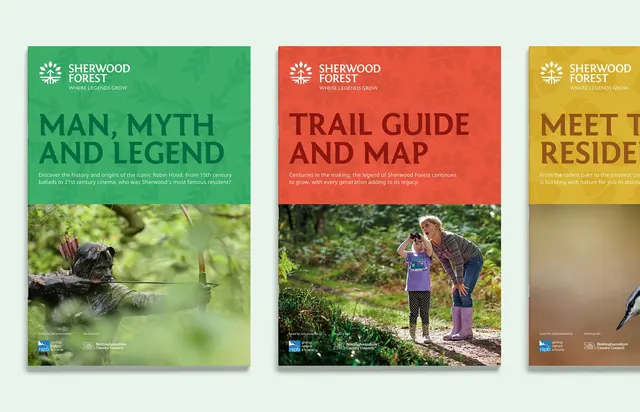
Three landscape-interpretation posters with bold, saturated color headers and dramatic nature photography anchoring each design.
Summary
Three landscape-interpretation posters featuring vibrant, saturated color headers with contrasting nature photography below, unified by the Sherwood Forest logo and typographic hierarchy.
Visual description
A triptych of poster designs, each 2:3 aspect ratio. Left (green): "Man, Myth and Legend" header with dark forest photographs. Center (coral red): "Trail Guide and Map" with a colour-rich outdoor group portrait. Right (mustard gold): "Meet The Residents" with soft-focus nature detail. Each poster uses a solid, full-width color bar at the top containing white logo, title in display weight sans-serif, and supporting copy, with the photograph occupying the lower two-thirds. All three share consistent logo placement and footer with institutional branding.
Key takeaway
Solid color blocking as a confident frame for photography; the display-weight sanserif creating visual hierarchy across a three-poster series; the warm, earthy palette (greens, rust, gold) anchoring a heritage/nature brand identity.
Reuse notes
Strong for visitor centers, heritage sites, tourism boards, and interpretation design. The oversized photography dominates; pair with readable type locked to the color bar. Works at printed poster scale and as digital marketing assets.