Preview image. Unlock full-res
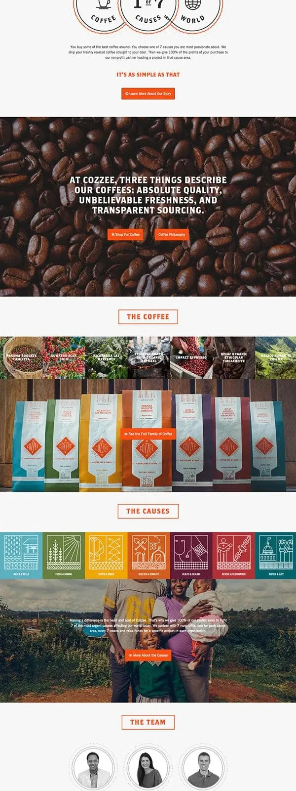
Full-page website screenshot for a mission-driven coffee brand emphasizing social impact, sustainability, and product sourcing.
Summary
A full-page website for a coffee brand communicating product sourcing, impact metrics, and team values through bold typography, split imagery, and circular icon systems.
Visual description
The layout spans multiple sections stacked vertically. Top hero features a split image: left showing packaged coffee product (mint/teal packaging) and right showing an outdoor environmental/social impact scene (person in field). Bold, oversized sans-serif headline "CHOOSE YOUR COFFEE" dominates left; "CHOOSE YOUR CAUSE" mirrors right. An orange banner with white text provides mission statement copy. Below, a "HOW IT WORKS" section uses three circular icons arranged horizontally, each with a number and label (appears to be 1 of 7, etc.). Further down: a large close-up photograph of coffee beans with text overlay, followed by product rows showing multiple colorful coffee bags (seven variants in different colors: teal, red, orange, yellow, green, purple, teal). A "THE CAUSES" section follows with colored blocks representing different social initiatives. Bottom section shows the team in portrait. Footer appears orange with contact/navigation info. Overall design uses alternating full-width photography and content blocks.
Key takeaway
Bold, mission-first design: oversized typography paired with unambiguous color (orange accent) and real photography tells a story of transparency and social responsibility. The circular "process" system and product lineup build trust through clarity and structure.
Reuse notes
Reference for B2B or B2C sustainability/impact brands (food, fashion, nonprofits). The bold color choice (orange) is memorable and stands out in context, so consider if your brand palette can support it. The split image and "choose two things" framing is reusable for product-plus-purpose positioning. Works well for long-form storytelling on a landing page or internal "About" section. Avoid if you don't have strong visual content (photography of products, impact, team) to carry the layout's ambitions.