Preview image. Unlock full-res
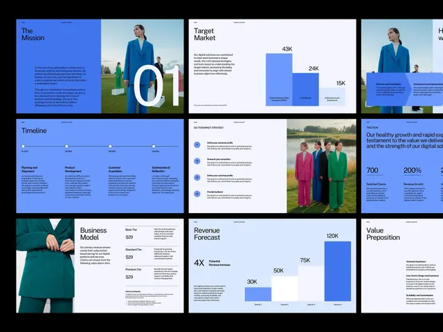
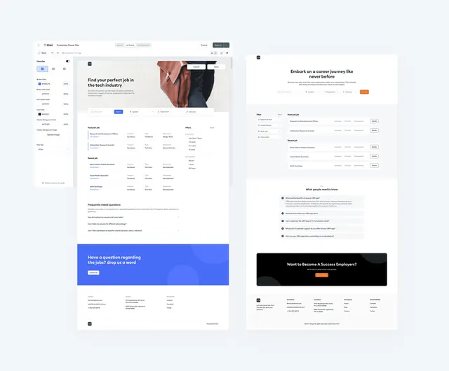
Retail/ecommerce desktop screens showing sidebar-nav product listing, hero sections with product photography, and hero CTAs in blue and black.
Summary
A responsive ecommerce desktop mockup with a left sidebar navigation menu, product grid with hero product shots, and two prominent hero sections featuring blue and black CTAs.
Visual description
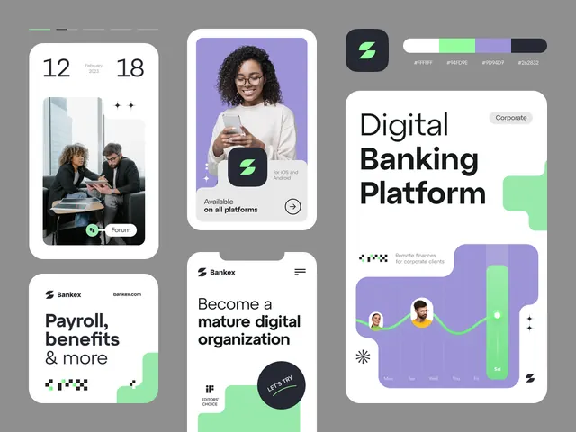
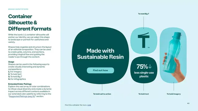
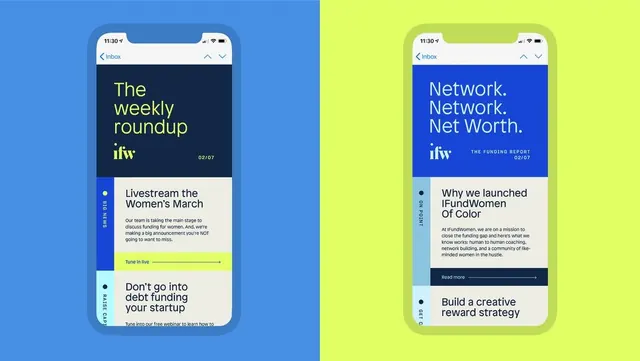
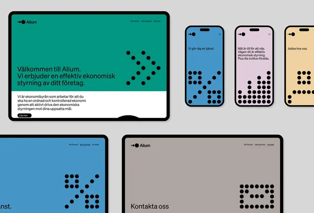
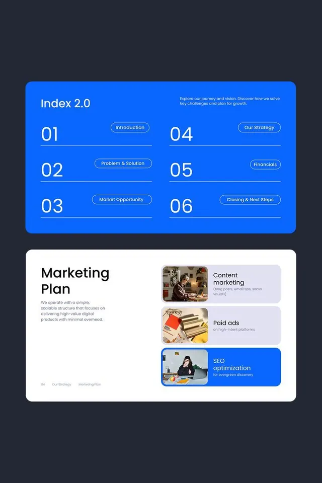
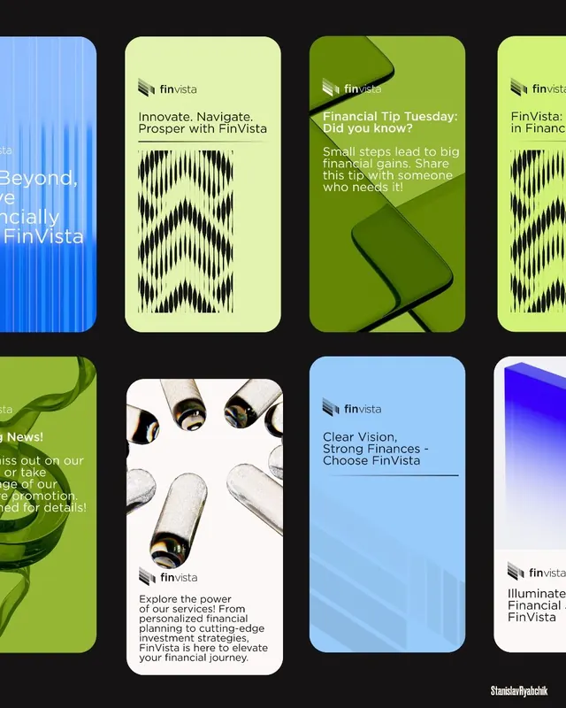
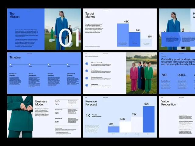
Four screens arranged in a 2x2 grid against a light background. Left column shows a sidebar navigation pattern: a compact left rail with icon and text links, feeding a product grid with thumbnail images and product cards. Right column features two full-width hero sections, each pairing large product photography (fashion/apparel) with a hero headline, subtext, and a primary CTA button in bright blue or black. The palette is light gray-white with blue (#526FEA) as the accent color and near-black for text and secondary elements. Sans-serif throughout, generous whitespace, and a modern grid-based layout.
Key takeaway
The compact sidebar-plus-content pattern for horizontal breathing room. The blue-on-light CTA contrast and placement to convert. The consistent product photography treatment creating visual rhythm across screens.
Reuse notes
Strong default for retail, ecommerce, and product-heavy platforms on desktop. Sidebar nav scales well for catalog browsing. Blue CTA works best on light backgrounds; test the contrast on mobile-collapse scenarios. The hero product layout pairs well with e-commerce onboarding flows.