Preview image. Unlock full-res
Mobile interface for content publishing with black background, monochromatic toolbar, and gradient-filled call-to-action button.
Summary
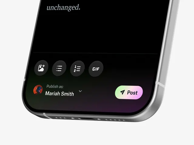
Mobile publishing interface with a pure black background, italicized header text, horizontal icon toolbar, and a prominent gradient button (pastel green to pink) containing a send/post icon.
Visual description
Bottom portion of a mobile device screen in portrait orientation. The main content area uses a pure black background. At the top, italic sans-serif text reads "unchanged." Below, a horizontal toolbar of four circular icons (photo editing, bulleted list, numbered list, and GIF) in dark gray with white line-art symbols on a slightly lighter circular background. The middle section shows user attribution with a small circular profile photo (abstract red/blue artwork), text "Publish as: Mariah Smith" in white, and a dropdown arrow. The bottom anchor is a large, pill-shaped button with a soft gradient (pale green to pale pink) containing a paper-airplane icon and the text "Post" in black sans-serif. The device bezel is visible on the right edge.
Key takeaway
The use of a gradient button to create visual pop against a pure black background without relying on saturation. The circular icon button style (dark gray background, white line art) that is both minimal and touchable. The user attribution pattern with profile photo plus text plus dropdown, leaving space for identity without cluttering the interface.
Reuse notes
Effective template for content-sharing or publishing platforms targeting mobile-first users. The gradient button is energetic enough to draw attention but soft enough to feel contemporary. The flat design and minimal color palette work well in media, saas, and social applications. The icon toolbar can be adapted for different content actions, and the user selector dropdown is a practical pattern for multi-account apps.