Preview image. Unlock full-res
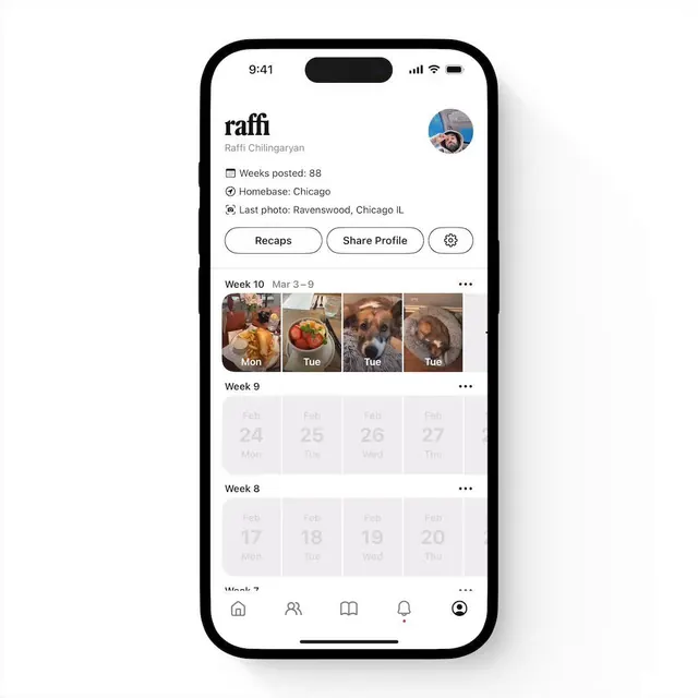
Mobile app profile card for Raffi Chiilingaryan with timeline of photo posts organized into weekly grid sections, user avatar, and action buttons.
Summary
A profile screen for a photo timeline app showing a user's metadata (weeks posted, location, latest photo location), three action buttons, and a scrolling history of weekly photo grids organized chronologically.
Visual description
A light background mobile interface with a profile header showing the username "raffi" in bold serif, user's full name "Raffi Chiilingaryan" below, a circular blue-tinted profile photo at top right, and three key stats with icons: calendar icon "Weeks posted: 88", location pin "Homebase: Chicago", and camera "Last photo: Ravenswood, Chicago IL". Below is a horizontal button group with three rounded-outline buttons: "Recaps", "Share Profile", and a gear settings icon. The main content area shows a scrollable timeline of weeks, each labeled "Week 10", "Week 9", "Week 8", etc., with Week 10 displaying a 4-column grid of actual photo thumbnails (food, pet, dessert, landscape), while earlier weeks show placeholder light-gray cards with faded dates. Bottom navigation bar with five icons (home, people, bookmarks, notifications, profile) in black. Overall palette is white/gray/black with warm brown earth tones in photo content and subtle blue accent on the profile avatar.
Key takeaway
The contrast between populated (Week 10 with vivid photos) and empty (Week 9-8 greyed-out placeholders) states guides scanning without cluttering. The icon+label metadata card at the top is scannable and reduces text density. Three horizontal action buttons are aligned and balanced, making secondary CTAs discoverable without drowning out the timeline.
Reuse notes
Excellent template for social/media apps with chronological or activity-driven content (photo logs, journals, fitness tracking). The gray placeholder strategy is better than hiding empty states; it sets expectations for the timeline structure. Best paired with rich image content; the design's minimalism relies on photos carrying visual interest. Works for portfolio apps, memory timelines, or any profile-centric social platform. The serif display typeface for the username adds personality without sacrificing legibility.