Preview image. Unlock full-res
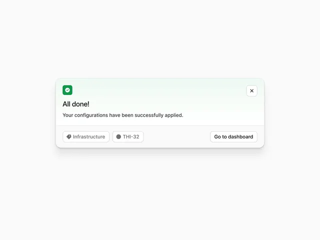
Minimal success modal announcing a completed configuration with a green checkmark icon, action breadcrumbs, and a primary CTA button on a light background.
Summary
A success confirmation modal on a light gray background, centered, with a green rounded-square checkmark icon, the title "All done!", confirmatory copy, breadcrumb-style tag buttons, and a prominent "Go to dashboard" button.
Visual description
Off-white background (very light gray) surrounding a centered modal with a soft rounded border and subtle shadow. Inside: a small green rounded-square icon with a white checkmark at the top-left. Large sans-serif headline "All done!" in dark gray. Two lines of supporting copy in medium gray: "Your configurations have been successfully applied." Below that, a light divider line. At the bottom, two small gray pill-shaped badge buttons labeled "Infrastructure" and "THI-32" (breadcrumb-style tags), followed by a larger white button with dark text and a subtle border reading "Go to dashboard". The entire composition emphasizes whitespace and calm; all elements are left-aligned except the close (X) button at the top-right. The color palette is restricted to whites, grays, and a single accent green.
Key takeaway
The green checkmark icon in a small rounded container is a confident, instantly readable success signal that doesn't scream for attention. The two-line copy pattern (headline + context) is clear and reassuring. The breadcrumb-tag pattern below the divider tells the user what they just completed without repeating it in the main copy. The primary CTA is prominent but calm; the button doesn't need bright color to be noticed.
Reuse notes
Ideal pattern for post-action confirmation flows in SaaS apps (configuration, deployment, checkout completion). The calm neutral palette works across industries and does not override the user's relief at success. The breadcrumb tags are optional but useful when the user may have multiple items in flight. Pairs well with subtle background blur or overlay. Caveat: the fixed position and centered modal expect desktop/tablet; mobile may need a bottom-sheet variant.