Preview image. Unlock full-res
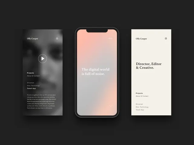
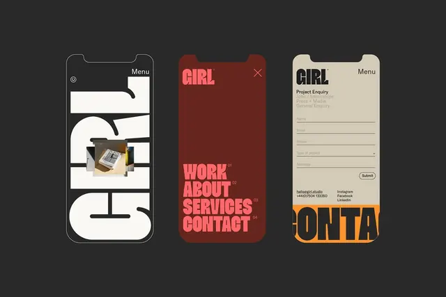
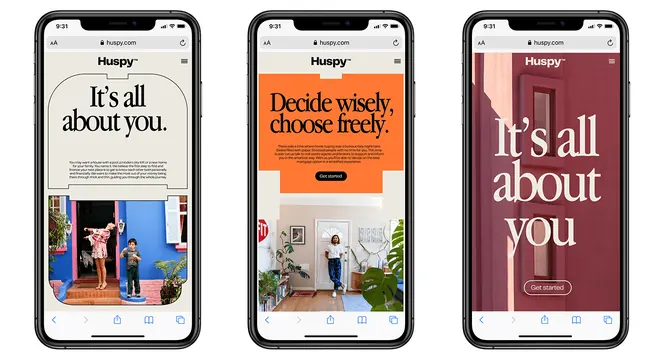
Three mobile UI screens showcasing large editorial typography in cream, orange, and burgundy single-color backgrounds, each paired with photography below the fold.
Summary
Three mobile UI screens showcasing large editorial typography in cream, orange, and burgundy single-color backgrounds, each paired with photography below the fold.
Visual description
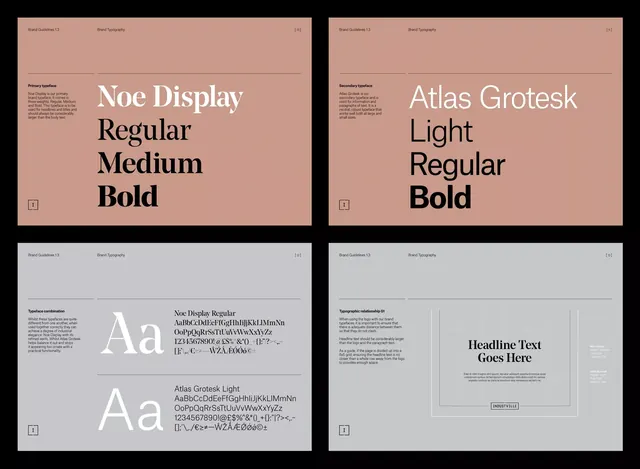
Three phone mockups side by side. Left screen: cream background with large black typography "It's all about you" and body text, photo of two people below. Center screen: vibrant orange background with white text "Decide wisely, choose you," and photo of a woman indoors below. Right screen: burgundy/mauve background with white text "It's all about you," and photo below. All three share identical layouts: full-bleed color field for the top 60-70 percent of the viewport, generous leading in the headline, supporting body copy in smaller type, and a photography cutoff at the bottom. The spacing is generous and breathing; the sans-serif type is confident and large.
Key takeaway
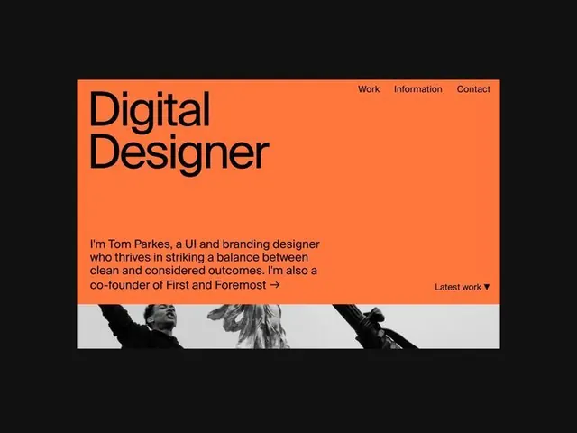
Full-bleed single-color backgrounds that don't compete with the large typographic headline; the hierarchy created by headline size and color against background; the pairing of generous white space with photography that starts below rather than competing with text; the use of analogous warm colors (cream, orange, burgundy) across variations to show personality range.
Reuse notes
Ideal for lifestyle, retail, or personal-brand mobile experiences where the brand voice is confident and the user story is single-focused. Works for landing screens, welcome flows, or feature intros where one message per screen is the goal. The bold type needs genuine editorial content (not generic taglines) to land. Only works on mobile with viewport height sufficient for both generous headline space and photography below.