Preview image. Unlock full-res
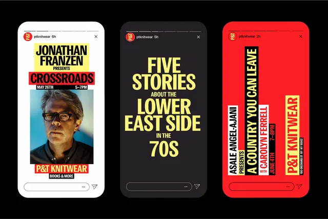
Three mobile card interfaces displaying book titles (Jonathan Franzen, a Lower East Side collection, and a poetry title) with bold all-caps typography rotated vertically and high-contrast color blocking.
Summary
Three mobile card interfaces in a horizontal row, each displaying a book title with author name and accent text in bold all-caps type rotated 90 degrees vertically, set against full-bleed color backgrounds (white, dark gray, and bright red).
Visual description
Three identical-width mobile phone frames arranged horizontally: left frame has white background with Jonathan Franzen's "Crossroads" book cover photo (headshot in top third) and red "Post Knitwear" accent text; center frame has dark gray/charcoal background with yellow all-caps headline "FIVE STORIES ABOUT THE LOWER EAST SIDE IN THE 70S" with red circle logo; right frame has bright red background with white and red rotated all-caps text reading vertically "ASHLEY POSTON / A COUNTRY YOU CAN CALL HOME / POET TIMBER" plus red circle logo top-left. Each card uses rounded rectangle frame, rounded home indicator, and minimal chrome. Typography is highly contrasted: bold sans-serif in either white or red depending on background, creating striking visual impact.
Key takeaway
Rotating text 90 degrees on a mobile card creates dynamism and forces the eye to engage actively with the design. Color-blocking full-screen (not contained in a box) makes the card feel bold rather than precious. Minimal text labels paired with strong image or color creates a gallery effect suitable for discovery/browsing. Using a single accent color (red, yellow, or white) per card maintains coherence even with different background colors.
Reuse notes
Excellent for book discovery apps, music or media streaming apps, or content curation platforms where visual impact matters more than detailed information. Works on mobile-first where vertical space is plentiful. The rotated typography is attention-grabbing but requires careful font choice to remain readable; use bold, condensed sans-serifs. High contrast essential for legibility.