Preview image. Unlock full-res
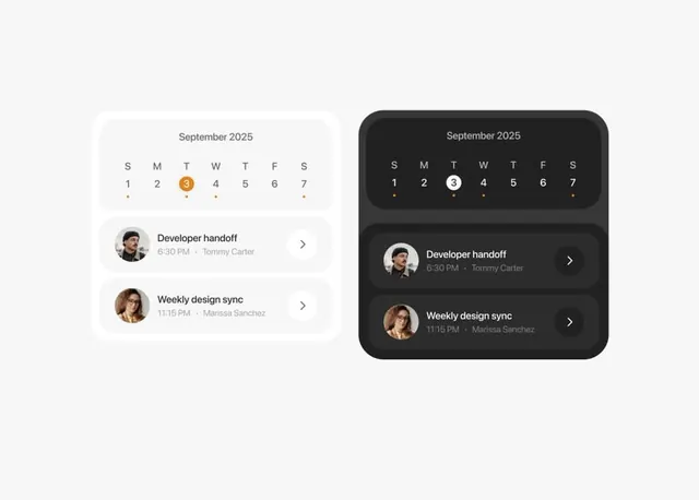
Dual-theme calendar app interface showing light and dark modes side-by-side, with event cards listing meetings and time details under a September 2025 calendar grid.
Summary
A calendar application UI showcasing paired light and dark theme variants, each featuring a September 2025 calendar grid with orange accent date and below-calendar event cards showing upcoming meetings with participant avatars.
Visual description
Two rounded-rectangle containers side-by-side, light (#F7F7F7) on left, dark (#212121) on right. Each displays a 7-column calendar grid (S M T W T F S) with minimal styling. One date (the 3rd) highlighted with orange accent circle. Below the calendar, two event cards stack vertically per theme: each card shows a small circular avatar image, event title (e.g. "Developer handoff"), time (e.g. "6:30 PM"), and organizer name (e.g. "Tommy Carter"). Cards have subtle background fill and right-pointing chevron. Sans-serif typeface throughout, neutral gray text in light theme, light gray text in dark theme. Spacing is tight but readable.
Key takeaway
The orange accent providing focus on a single interactive date without dominating the layout. The event card pattern (avatar + title + time + name + chevron) is scannable and works in both light and dark modes. The visual system is highly replicable: minimal borders, monochromatic, relying on background fill for card definition rather than shadows.
Reuse notes
Best for productivity and scheduling tools that need to support both light and dark user preferences. The card pattern scales to multiple events or days. The orange accent is impactful because the rest of the palette is monochrome; consider pairing with other accent colors for different contexts. Works well at mobile or small-screen sizes.