Preview image. Unlock full-res
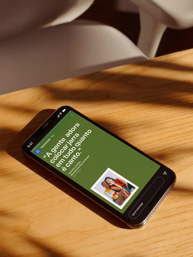
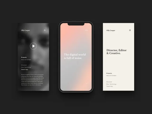
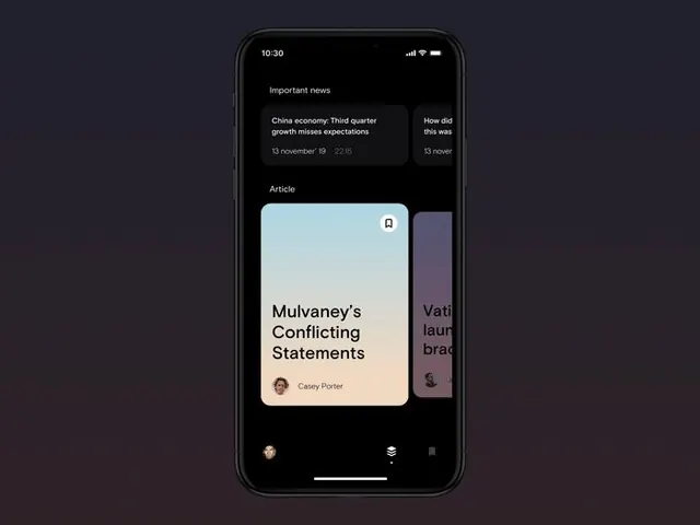
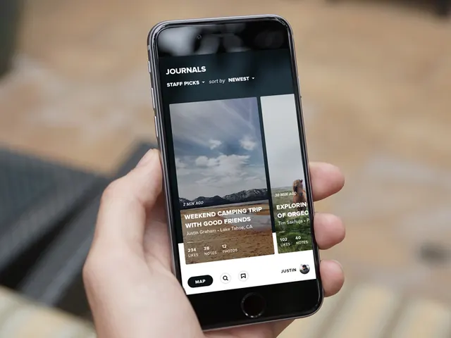
Mobile app presenting a curated editorial feed as stacked card-list with thumbnail images, using warm earth tones and high-contrast typography to guide content discovery.
Summary
A mobile app presenting editorial content in a vertically stacked card feed, each card pairing a thumbnail image with truncated headline and metadata, arranged for quick scanning and tapping to detail.
Visual description
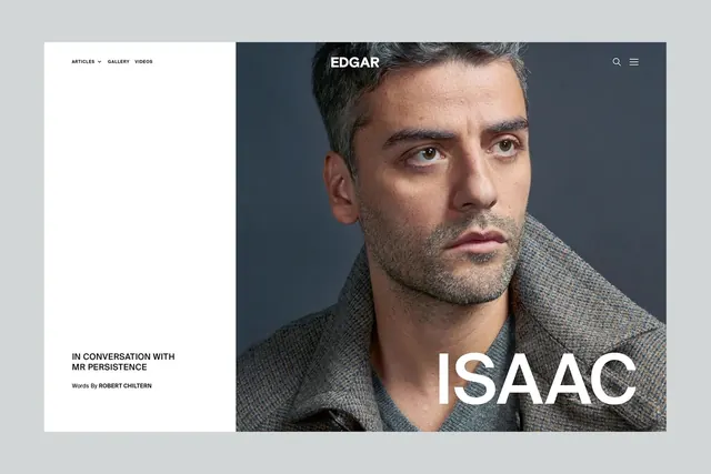
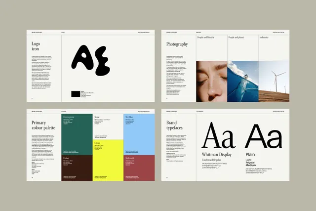
A smartphone held in-hand showing an editorial app's content list. Cards are stacked vertically with landscape thumbnail images anchoring each, followed by headline text in a bold sans-serif and smaller metadata lines (author, date, or category tags). The palette mixes warm earth tones (tan, warm grey) with cool dark greys and blacks, creating high contrast for readable hierarchy. No bright colors; typography dominates the visual language. The layout is generous with whitespace between cards, letting each item breathe.
Key takeaway
The two-layer card design: image + text stacked but tight, so a single tap feels like a single gesture. The warm neutrals create editorial gravitas without darkening the mood. Bold headlines paired with lighter subtext lets hierarchy happen through weight, not size.
Reuse notes
Strong for editorial, news, or content-discovery apps where users browse for interest. Works best with a steady supply of good images; text-only fallback would need rework. The warm palette reads editorial and premium rather than casual or playful.