Preview image. Unlock full-res
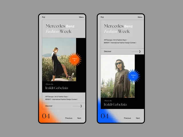
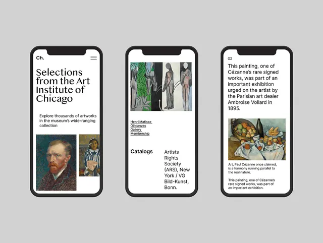
Three minimalist mobile app screens are shown in black smartphone mockups on a light gray background, each using large editorial typography and art imagery.
Summary
Three minimalist mobile app screens are shown in black smartphone mockups on a light gray background, each using large editorial typography and art imagery.
Visual description
The image shows three iPhone-style screens centered on a pale gray canvas, each framed by a thick dark bezel with a top notch. The left screen features a large serif headline above smaller body text and two artwork thumbnails, the middle screen mixes an artwork image with underlined text links and a two-column text block, and the right screen pairs a paragraph, an artwork image, and a caption-like text block.
Key takeaway
Use oversized serif headlines with generous white space to make an art or culture interface feel editorial and premium. Combine image blocks and compact text modules in a simple grid so the hierarchy reads instantly.
Reuse notes
This works well for museum, archive, or gallery products where content is the focus and the interface should feel more like a publication than a standard app. Reach for it when you want a clean, high-end presentation of rich visual content without heavy chrome or UI clutter.