Preview image. Unlock full-res
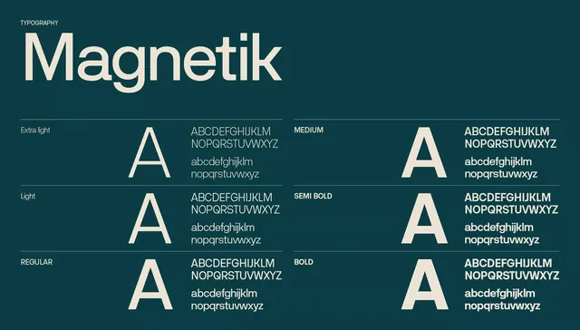
A font specimen showcasing six weights of the Magnetik sans-serif typeface arranged in a two-column grid against a deep teal background.
Summary
A type specimen for Magnetik, a geometric sans-serif, displaying six weights in a systematic two-column grid layout with a teal background and cream typography.
Visual description
Deep teal background with a cream-colored "TYPOGRAPHY" label at top left. The typeface name "Magnetik" appears large in the lightest weight, centered across the full width. Below, a two-column grid shows paired weight variants. Each row pairs a single capital A glyph (demonstrating weight contrast) with a full character set and sample text, labeled by weight: Extra light, Light, Regular (left column), Medium, Semi Bold, Bold (right column). Typography is set in the specimen sans-serif itself, clearly differentiating stroke thickness across the six weights. Subtle horizontal rules separate rows. Clean negative space dominates the composition.
Key takeaway
The grid layout showing side-by-side weight comparison within a single specimen view, the pairing of glyph isolation with full alphabet sample to demonstrate utility, and the restrained color palette that lets the letterforms dominate.
Reuse notes
Strong reference for type design portfolios and foundry sites. Works well as a print specimen. Teal-and-cream palette is distinctive; replicating it requires intentional color choice.