Preview image. Unlock full-res
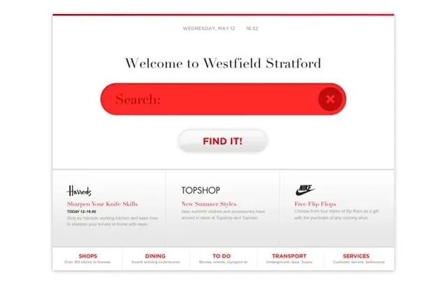
A light-mode mall directory welcome screen with a large red pill search bar, a 'FIND IT!' button, three promo tiles with retailer logos, and a red category nav row.
Summary
A light-mode shopping-centre welcome screen built around a single large red search field, with three retailer promo tiles below and a red category navigation row at the base.
Visual description
A white canvas capped by a thin red rule along the top. A small centered date and time line ("WEDNESDAY, MAY 12 | 16:32") sits at the top, followed by a large serif headline "Welcome to Westfield Stratford". Below it a wide, rounded red pill search input reads "Search:" with a circular dark close/clear button at its right end. A soft, rounded off-white "FIND IT!" button in red all-caps type sits centered beneath the search bar. A faint horizontal divider separates the top zone from a three-column promo band, each cell pairing a retailer logo (Harrods, Topshop, Nike) with a small red serif offer title and gray supporting copy. A final full-width row lists five red all-caps categories (SHOPS, DINING, TO DO, TRANSPORT, SERVICES), each with a one-line gray descriptor.
Key takeaway
One oversized, saturated red search pill carries the entire screen, making the primary action unmistakable on a kiosk or portal home. The restrained white field plus a single accent red keeps a content-heavy directory calm and scannable.
Reuse notes
Reach for this pattern on wayfinding kiosks, mall or venue directories, and search-first landing portals where finding something fast is the main job. The centered search plus promo tiles plus category row is a reusable three-tier structure. The bright red works as a focal accent but would overwhelm if used beyond the search bar and calls to action.