Preview image. Unlock full-res
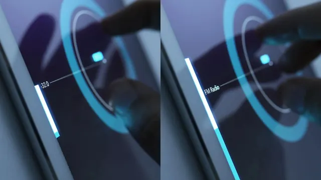
A side-by-side comparison of two mobile app interfaces showing different text labels and UI elements.
Typesans-serif, monospace
Industrydata, developer-tool, saas
Tagsmobile-app, ui-design, comparison, dark-mode, interface
Palette
#232938
#5F83B0
#72ADCC
#516B8A
#E4F3F5
Summary
A side-by-side comparison of two mobile app interfaces showing different text labels and UI elements.
Visual description
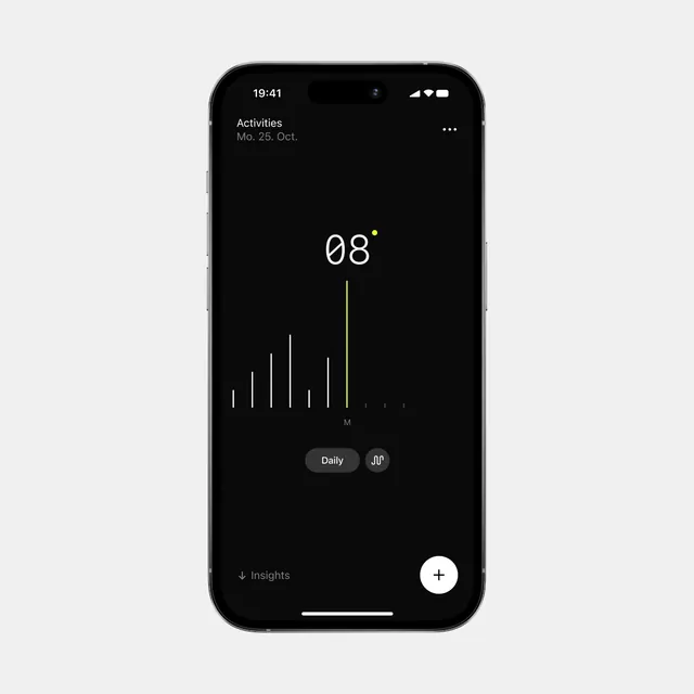
Two dark-themed mobile screens showing a circular progress or data visualization element with glowing blue accents. The left screen displays the text 'list' while the right screen displays 'match' in a small, monospace font.
Key takeaway
The design uses high-contrast neon accents against a dark background to highlight specific data points and navigation labels.
Reuse notes
Use as a reference for dark-mode UI components and technical data visualization styles.