Preview image. Unlock full-res
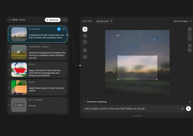
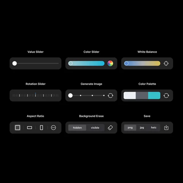
A dark, grid-based interface presents nine labeled control modules for image editing on a black background.
Summary
A dark, grid-based interface presents nine labeled control modules for image editing on a black background.
Visual description
The screen shows a black canvas with nine dark rounded control panels arranged in a 3 by 3 grid. Each module has a bold white label above it and contains a different slider, segmented toggle, or icon control in light gray, white, blue, and gold accents.
Key takeaway
Use strong negative space with evenly spaced rounded control cards to make a dense toolset feel calm and legible. The white labels above each module give the interface a clean, app-like hierarchy without adding visual clutter.
Reuse notes
Reach for this when designing image-editing, creative-tool, or parameter-control UIs that need to feel premium and simple. It works best when the interface has many small controls but only a few accent colors and minimal chrome.