Preview image. Unlock full-res
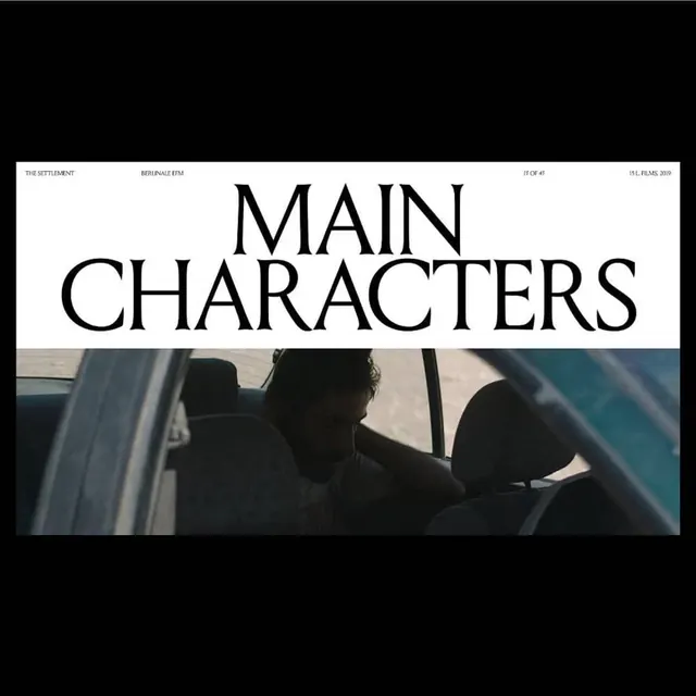
Minimalist film title card with centered all-caps sans-serif typography reading "MAIN CHARACTERS" over a shadowy film still, with metadata text in corners.
Summary
A minimalist film title sequence card featuring centered all-caps sans-serif type "MAIN CHARACTERS" over a darkened film still, with professional metadata text and clean black borders.
Visual description
A black-bordered frame containing two zones. The top half is a white/cream band with large centered all-caps sans-serif type reading "MAIN CHARACTERS" in black. Supporting text in smaller caps appears above the headline: "THE SETTLEMENT" on the left, "BERLINALE FFM" in the center, and "11 OF 41" and "ISL FILMS 2019" on the right. The bottom half is a grayscale film still showing silhouetted figures inside a car, underexposed and atmospheric. A thin black border frames the entire composition. The layout is symmetrical, grid-based, and strictly formal—classic film festival or arthouse cinema aesthetic.
Key takeaway
Typography and hierarchy in service of storytelling—the white band forces the type to own its presence, while the moody film frame below establishes tone. The metadata in corners grounds it in a real film context without cluttering the composition.
Reuse notes
Strong reference for film festival materials, movie posters, arthouse cinema branding, or any editorial context needing serious, sophisticated typography. The minimal approach lets the type shine while the dark image adds cinematic mood. Works well as a sequence of cards for a film's title sequence. Could adapt easily to other contexts (book covers, exhibition catalogs, art gallery materials). The Swiss-grid approach is timeless and internationally recognized.