Preview image. Unlock full-res
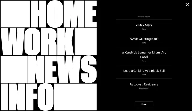
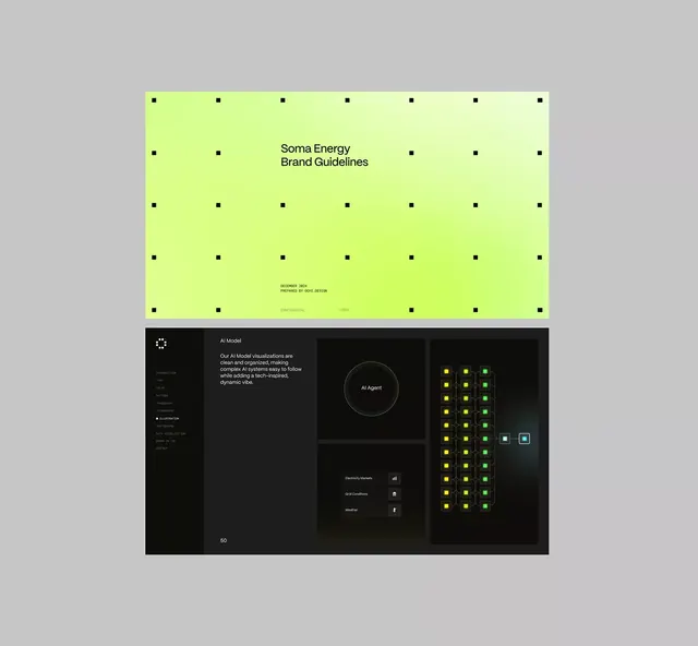
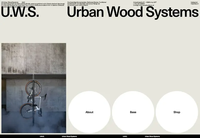
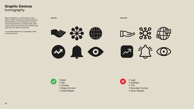
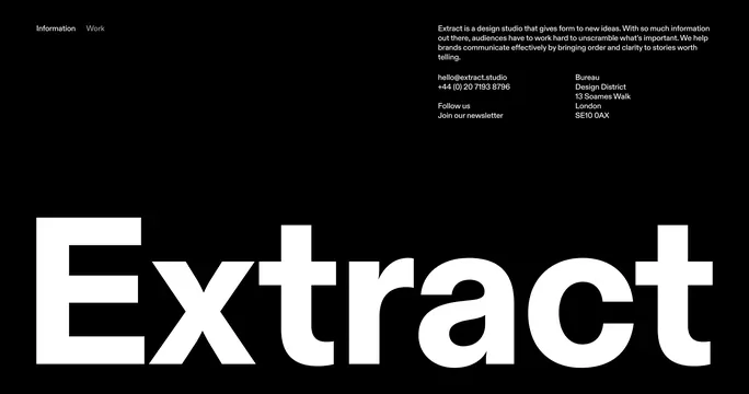
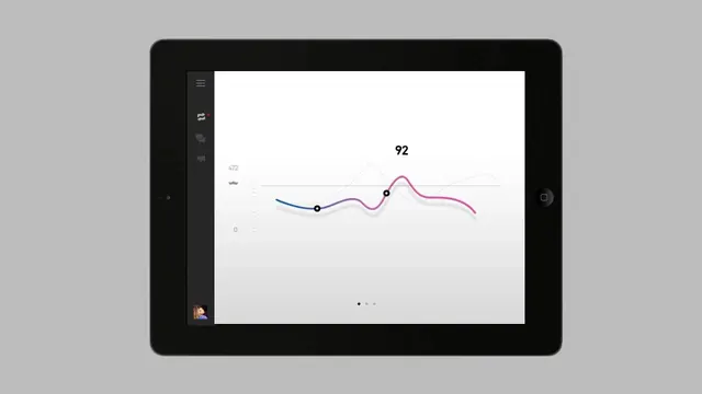
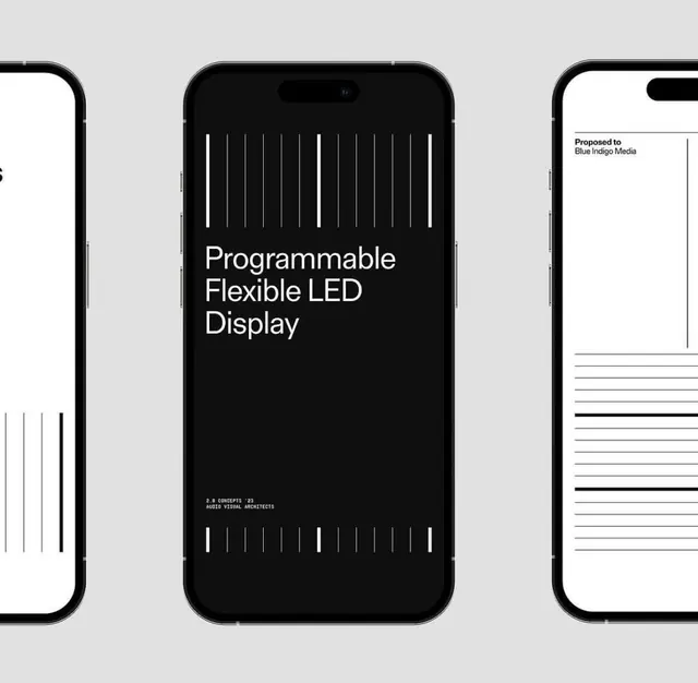
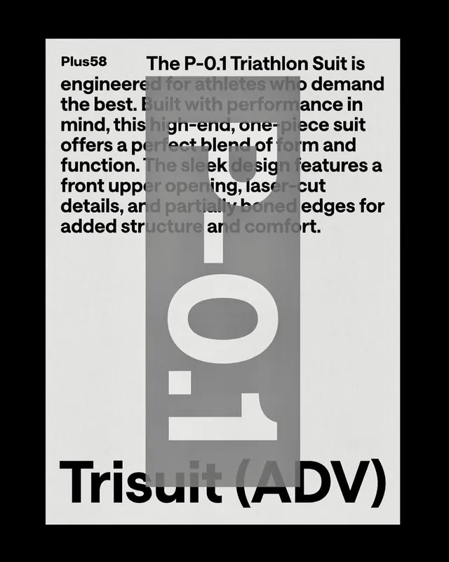
A design system or visual identity study for a design practice featuring a clean, geometric layout with balanced typography and minimal elements in a dark and light palette.
Summary
A design system or visual identity composition for a design practice featuring a stark high-contrast palette of deep purple and light gray, with geometric layout and minimalist typography presentation.
Visual description
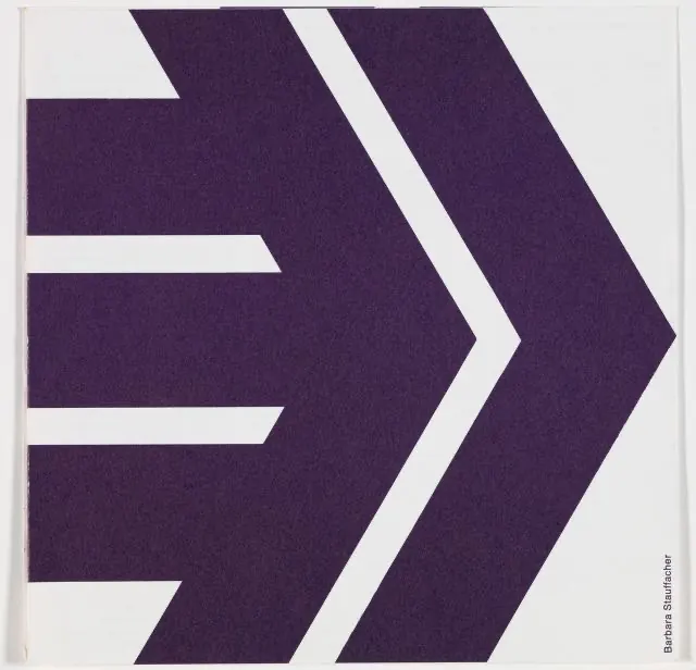
The composition is divided into sections with a high-contrast color scheme—deep purple (nearly black) on one side and light gray on the other. The practice's wordmark and branding elements are presented across the composition. The layout is geometric and grid-based, suggesting a systematic approach. Typography is clean and geometric sans-serif. Elements are spaced with generous whitespace. The overall aesthetic is modern, technical, and professional. The strict adherence to two colors creates a bold, contemporary visual identity.
Key takeaway
A two-color palette creates immediate visual impact and forces excellent use of whitespace and typography. The systematic approach suggests that the design system is adaptable and rules-based.
Reuse notes
Excellent for design system documentation, branding guidelines, and tech company identities. The high-contrast palette is striking and memorable. The minimalist approach works well for SaaS, developer tools, and modern technology brands. Strong for applications where clarity and precision are priorities.