Preview image. Unlock full-res
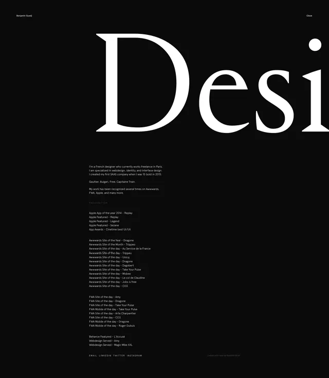
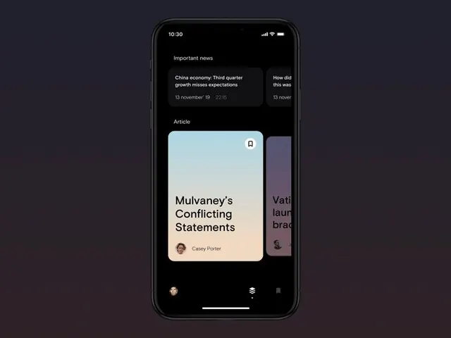
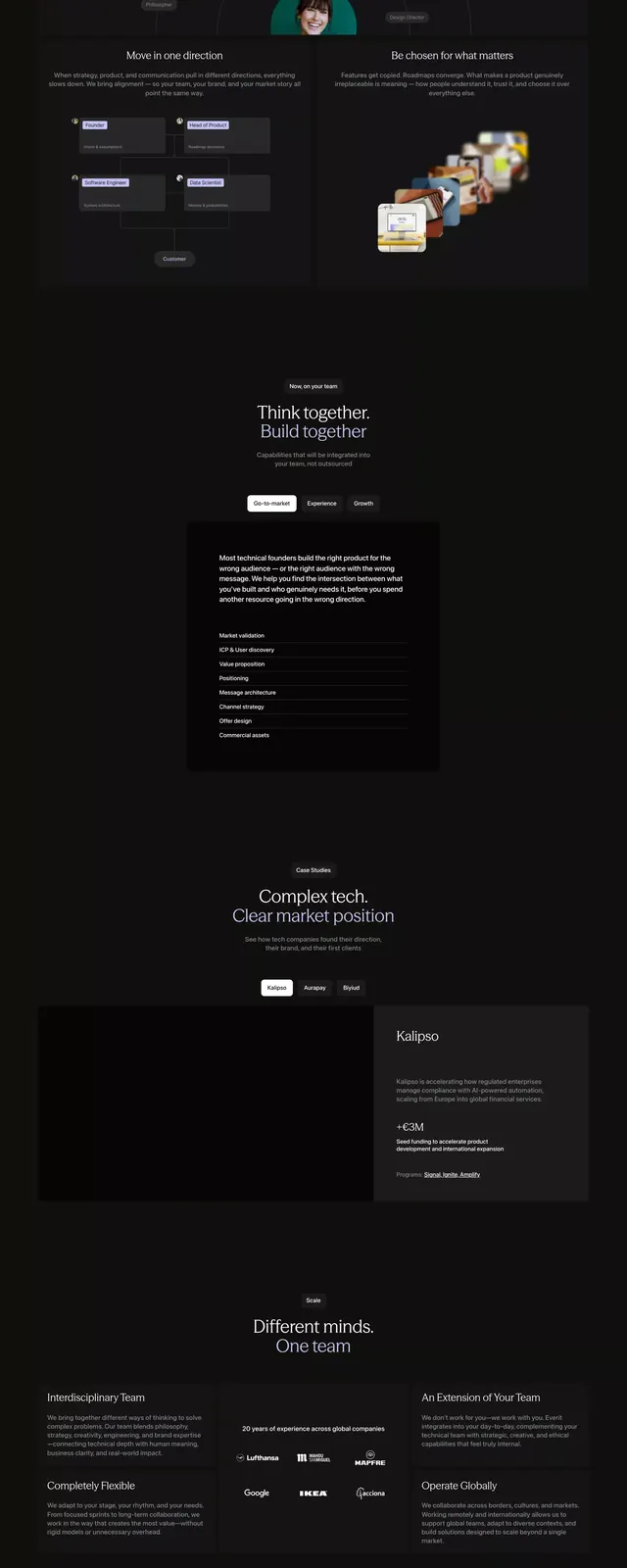
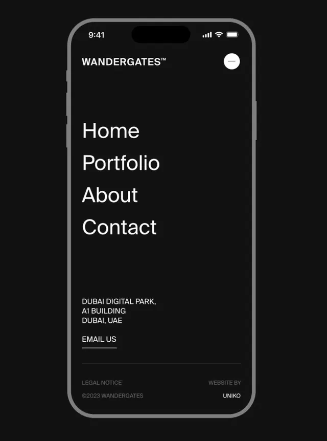
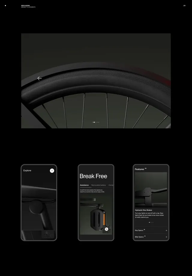
Vertical design mockup showcasing ZUNC Studio's archive interface with dark and light contrast.
Summary
A tall, narrow UI mockup from ZUNC Studio's archive featuring a dark theme with cool gray accents, demonstrating how archive/portfolio interfaces can balance information density with visual breathing room.
Visual description
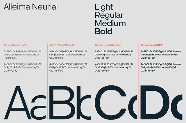
608×1080 vertical mockup. Dark charcoal background (#2C2E36) with cool light gray text and secondary elements (#BFC3C7, #9FA5AB). Typography appears to be the primary design element—sans-serif, likely hierarchically arranged. No imagery visible; the focus is on layout, whitespace, and typographic contrast. Generous margins suggest a portfolio or archive context where each item gets its own breathing room. The color palette is restrained; the entire visual hierarchy lives in typography and spacing alone.
Key takeaway
Dark mode doesn't require color. Monochromatic typography and spacing can be highly sophisticated. Archive interfaces benefit from visual simplicity; letting content speak without competing visuals.
Reuse notes
Excellent reference for design studio portfolios, archives, and documentation sites. Dark UI is popular in design and tech but often adds unnecessary color; this proves restraint wins. Good for vertical/mobile-first layouts. The typography-first approach scales well across devices. Works particularly well for work that demands close reading (case studies, articles, type specimens).