Preview image. Unlock full-res
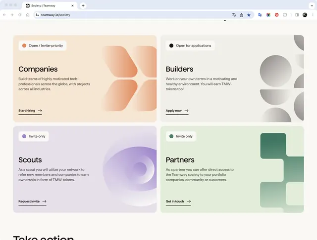
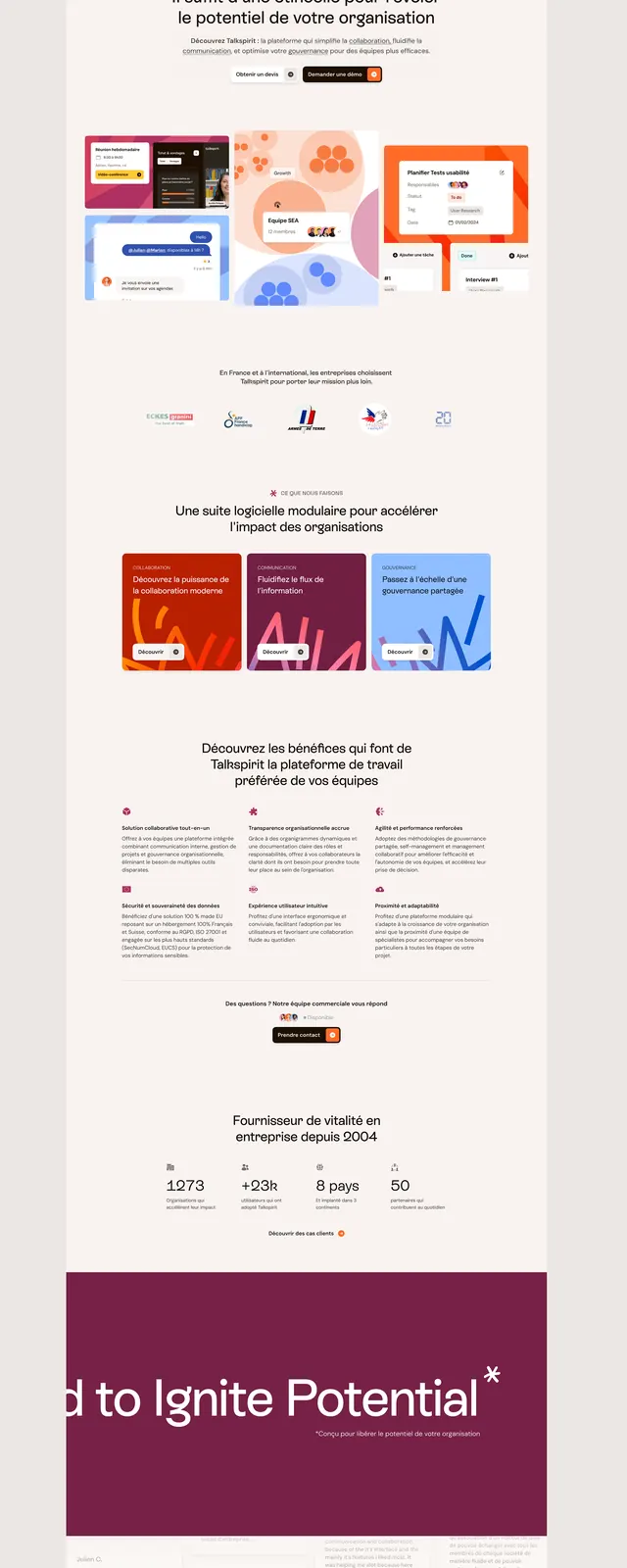
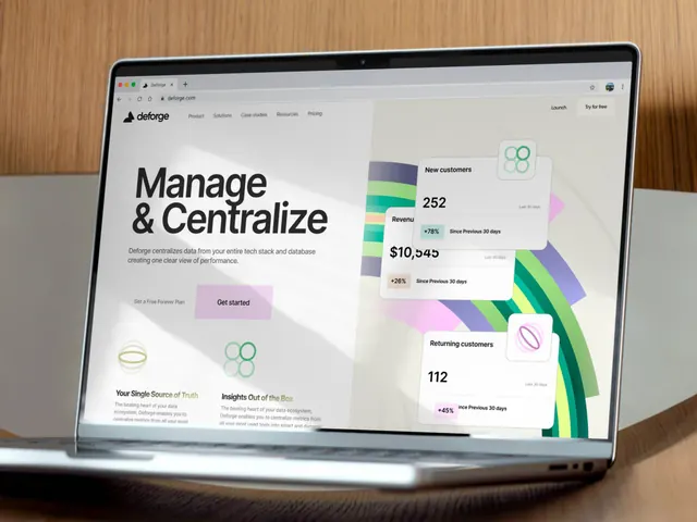
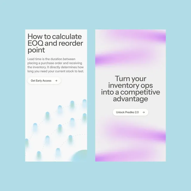
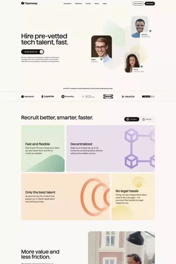
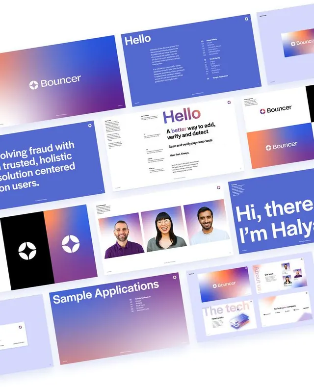
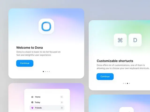
A collection of card components with soft gradient backgrounds and subtle typography, demonstrating a modern design system.
Summary
A design system showcase featuring multiple card components with soft, pastel gradient backgrounds and clean typography, demonstrating a modern, cohesive visual language.
Visual description
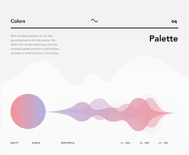
Multiple rectangular card components arranged in a grid layout. Each card features a subtle gradient background: soft lavender (#F0E9FF), pale blue (#D8E8FF), or nearly-white tones. Typography is minimal and sans-serif, appearing to show metadata or content labels in dark gray. Cards appear to have subtle shadows or depth, suggesting elevation. The overall palette is cool and calming, with no bright accents. Components suggest a design system ready for implementation.
Key takeaway
The use of soft, differentiated gradients to create visual variety without introducing new colors. Gradients serve both aesthetic and functional purposes, making cards distinct while maintaining overall cohesion. This approach scales well across many components.
Reuse notes
Excellent foundation for a modern SaaS product or dashboard. The soft gradients work well for productivity tools, wellness apps, or anything wanting to convey calm professionalism. Easy to extend with additional card types. Pair with dark mode version for complete system. The light palette may need stronger accent colors for CTAs in some contexts.