Preview image. Unlock full-res
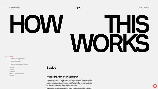
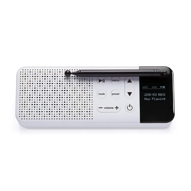
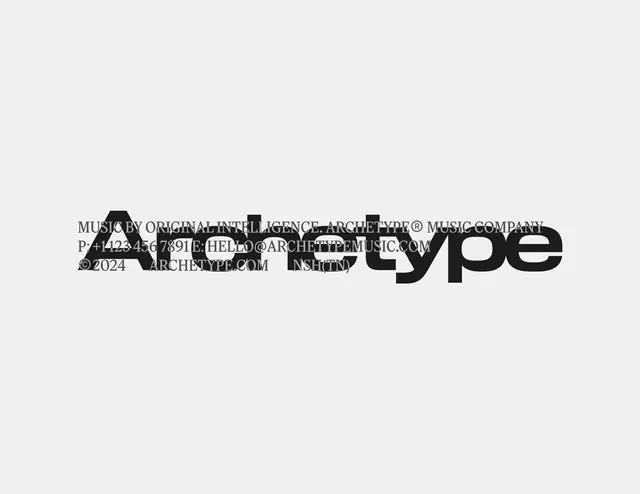
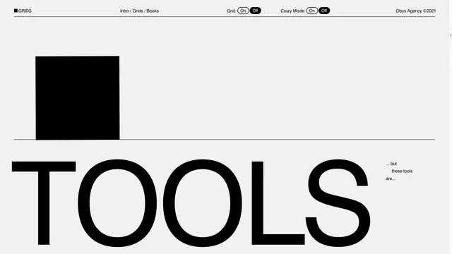
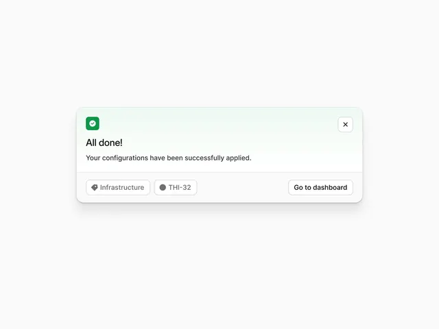
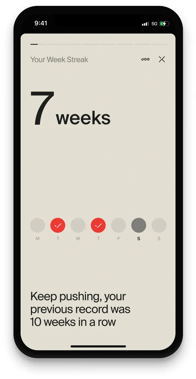
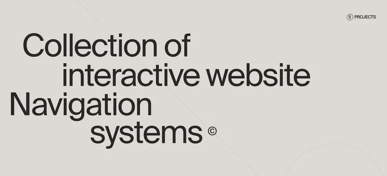
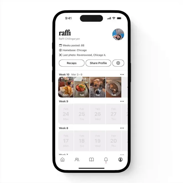
Clean, light-mode interface design with minimal styling, monochromatic palette, and generous spacing.

Summary
A light-mode interface design showcasing minimal components, clean typography, and monochromatic color restriction. Emphasizes clarity through whitespace and subtle visual hierarchy.
Visual description
Vertical mobile interface (640x800px) on a bright white background. Dark text on light background provides strong contrast for readability. Gray accents for secondary information or UI elements. Typography appears to use a clean sans-serif at comfortable sizes. Layout is spacious with generous padding around content. No color gradients, shadows are minimal and subtle.
Key takeaway
Light-mode minimalism prioritizes content legibility and user focus. The monochromatic palette eliminates distraction while the spacious layout prevents cognitive overload. This is a modern default for B2B and productivity apps.
Reuse notes
Strong baseline for SaaS, productivity tools, and professional applications. Easy to scan and navigate. Pairs well with a single accent color if needed. Accessible to users with various vision abilities. Works across devices due to restraint in styling and reliance on typography hierarchy.