Preview image. Unlock full-res
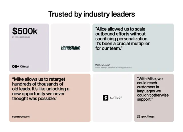
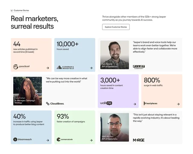
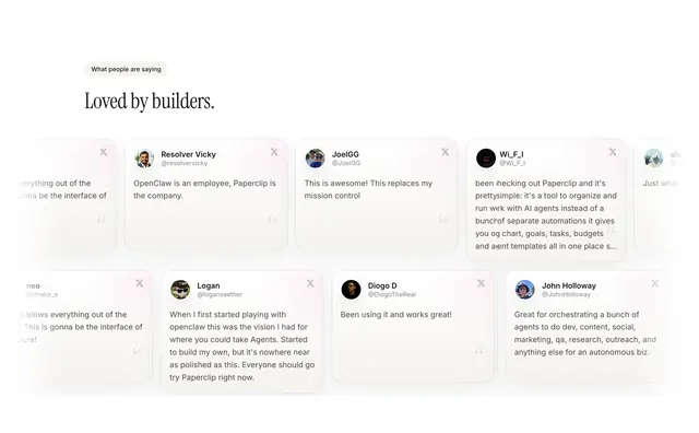
Bento grid of testimonial tiles mixing pastel quote cards, a big stat block, and centered customer logos in a single asymmetric panel.
Summary
A testimonials section laid out as a bento grid that interleaves pastel quote cards, a standout dollar-stat tile, and plain logo tiles. The defining move is mixing proof types (quotes, a metric, and brand logos) into one varied tile wall.
Visual description
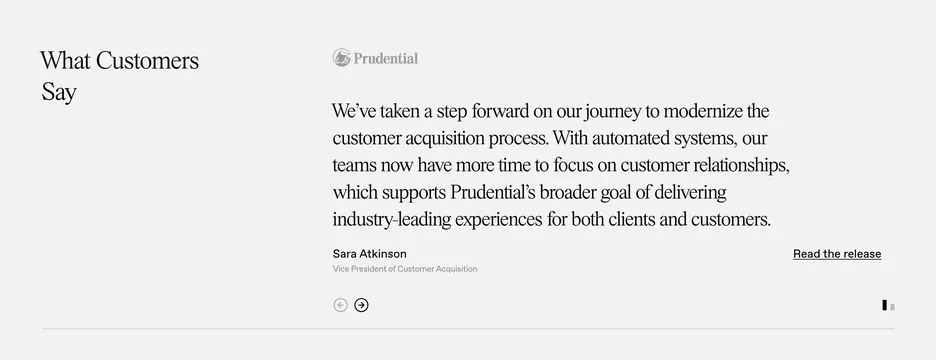
Centered black heading "Trusted by industry leaders" sits above a two-row bento of six rounded rectangles on a white field. Top row: a lavender tile with a large "$500k" stat and "on hiring costs saved" plus the Otter.ai logo, a neutral grey tile holding only the Handshake wordmark, and a wide grey card with a multi-line customer quote attributed to a named sales-ops manager. Bottom row: a peach tile with a longer quote and the Connecteam logo, a grey tile centering the SumUp logo, and a small grey tile with a short quote and the Spectinga logo. Tiles vary in width and tint while sharing the same soft corner radius.
Key takeaway
The bento format that lets a metric, a logo, and a written quote coexist as equal-weight tiles, so a single section carries several kinds of social proof. Muted pastel fills differentiate tiles without shouting and keep the focus on the words.
Reuse notes
Useful when you have uneven proof assets (a few strong quotes, one headline stat, several logos) and want them in one tidy block rather than three sections. The varied tile widths need a deliberate grid; pair with generous whitespace so the bento reads as composed rather than crowded.
More testimonials sections
See all




More like this


Keep what you find
A free account saves references to boards and can send you a weekly email of picks based on what you save.
To see every result, go Pro.