Preview image. Unlock full-res
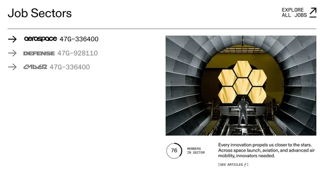
Light split-panel features section with a stylized vertical sector list on the left and a large photo, member stat, and copy on the right.
Summary
A white Job Sectors panel pairs a left-hand list of aerospace, defense, and cyber entries with a right-hand detail view showing a large industrial photo, a circular member count, and supporting copy.
Visual description
The section opens with a thin top rule, a left-aligned "Job Sectors" heading, and a right-aligned "EXPLORE ALL JOBS" text link with a diagonal arrow. Below a full-width divider, the left column lists three sectors, each prefixed by a right arrow and a numeric code. Active "aerospace" is black with a rounded lowercase wordmark; inactive "DEFENSE" and "CYBER" are grey with distinct display treatments (block caps and italic futuristic styling). The right column holds a wide rectangular photo of a technician before a gold hexagonal mirror array inside a metallic chamber. Beneath it, a circular ring graphic shows "76" beside "MEMBERS IN SECTOR" label copy, with a short paragraph and a bracketed "[ SEE ARTICLES ]" link to the right.
Key takeaway
Give each list item its own sector-specific display type so the navigation feels branded rather than generic. Pair a single dominant photo with one hard number to make the active tab's content immediately credible.
Reuse notes
Strong for industry hubs, economic development sites, or membership directories where categories need distinct personalities. Needs strong photography per sector and enough horizontal space for the split layout. The bordered, editorial list pattern reads best on light backgrounds.