Preview image. Unlock full-res
Dark feature section leading with a left headline and stacked product UI mockups, then a three-up bento row of capability cards above a case-study panel.
Summary
A long dark feature block that opens with a two-line headline and an orange CTA, then layers detailed product UI mockups, a three-column bento of capability cards, and a bottom case-study panel.
Visual description
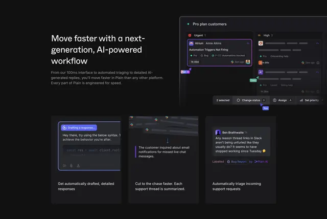
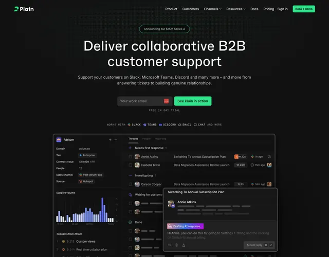
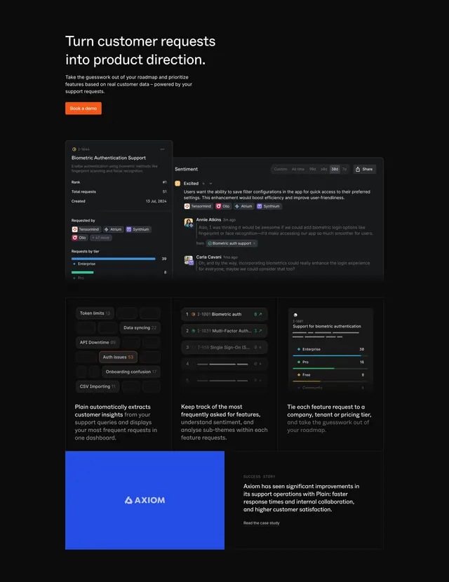
On near-black, a left-aligned two-line white headline ("Turn customer requests into product direction.") sits over three lines of muted body copy and a filled orange "Book a demo" button. Below, two overlapping dark product panels show a "Biometric Authentication Support" request detail with rank and tier bars, and a "Sentiment" thread with tagged avatars. Underneath, three equal dark cards each pair a small UI snippet (a cluster of tag chips, a ranked feature list, a tiered request chart) with a short caption about extracting insights, tracking asks, and tying requests to tiers. At the bottom a wide panel splits a solid electric-blue tile with the "AXIOM" logo on the left against a "SUCCESS STORY" blurb and "Read the case study" link on the right.
Key takeaway
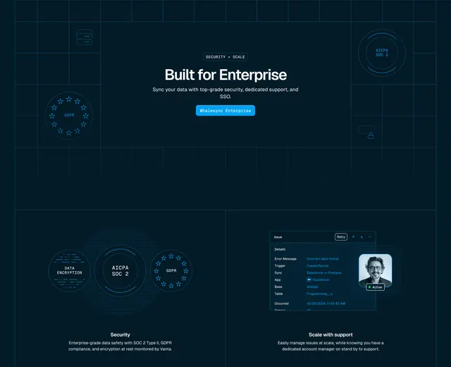
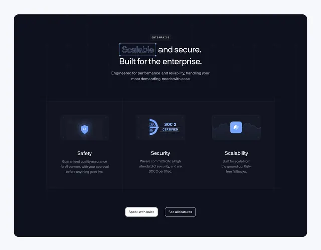
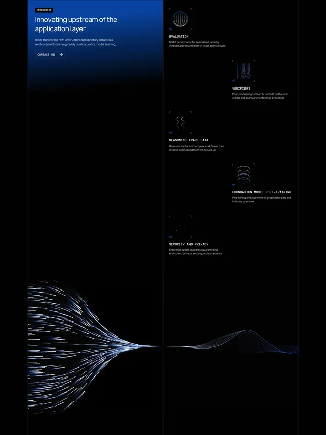
Stacking realistic, slightly overlapping product mockups makes the feature feel real before any list appears. The three-up bento of UI-snippet-plus-caption cards explains distinct capabilities without long paragraphs. Capping the section with a single brand-colored case-study tile turns features into proof.
Reuse notes
Best for a data- or workflow-heavy B2B product that can show genuine UI; the section lives or dies on the quality of those mockups. The single orange CTA against all-dark keeps one clear action. Long section, so place it deep on the page after the value proposition is set.