Preview image. Unlock full-res
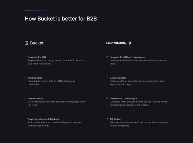
Dark two-column us-versus-them comparison with blue checks for Bucket and grey crosses for LaunchDarkly, split by a thin vertical rule.
Summary
A dark, text-only competitive comparison that sets Bucket against LaunchDarkly in two columns, using blue check icons for its own strengths and grey cross icons for the rival's drawbacks. The defining feature is the strict check-versus-cross symmetry across four matched rows.
Visual description
A short gradient tick mark sits above a left-aligned heading, "How Bucket is better for B2B", in white. Below, two columns each open with a brand label and small mark: "Bucket" with its glyph on the left, "LaunchDarkly" with an arrow icon on the right, separated by a faint full-height vertical divider. Each column lists four items, every item a bold one-line title with a two-line muted description beneath. The left column's titles are prefixed with small purple-blue checkmarks (Designed for B2B, Simple pricing, Intuitive to use, Customer adoption and feedback); the right column's are prefixed with dim grey crosses (Designed for B2C and ecommerce, Complex pricing, Complex and confusing UI, A/B testing). The whole block sits on a near-black field with generous spacing.
Key takeaway
The disciplined check-versus-cross icon system that reads instantly as good-versus-bad without color-screaming. Matching each of your strengths to a parallel competitor weakness on the same row makes the contrast feel fair and structured.
Reuse notes
Use on a competitor or alternatives page where you can name a real rival. Keep the row count low and the descriptions short so the parallelism stays scannable. The dark palette and single accent keep it from feeling aggressive, but it still reads as openly competitive.
More comparison sections
See all











More like this
Keep what you find
A free account saves references to boards and can send you a weekly email of picks based on what you save.
To see every result, go Pro.