Preview image. Unlock full-res
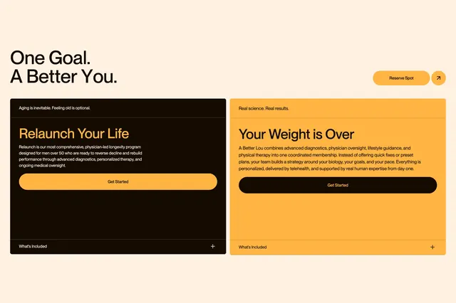
Cream-background feature section with an oversized headline and two inverted service comparison cards for longevity and weight programs.
Summary
A two-column service comparison block on a warm cream field, pairing a large section headline with side-by-side program cards that invert dark and orange color schemes.
Visual description
Light cream background fills the section. Top row splits left and right: left shows oversized bold sans-serif "One Goal. A Better You." in dark brown; right holds an orange rounded "Reserve Spot" button plus a small circular arrow icon. Below, two equal rounded cards sit side by side. The left card is dark brown with a small white tagline "Aging is inevitable. Feeling old is optional.", an oversized orange headline "Relaunch Your Life", white body copy about a physician-led longevity program for men over 50, an orange "Get Started" pill, and a footer row with "What's Included" and a white plus icon separated by a thin line. The right card inverts to vibrant orange with dark brown type: tagline "Real science. Real results.", headline "Your Weight is Over", body copy on coordinated membership care, a dark brown "Get Started" pill, and a matching footer with plus icon.
Key takeaway
Each card uses a full color inversion so two programs feel distinct yet structurally identical. The shared footer row with expandable "What's Included" keeps comparison scannable without leaving the card frame.
Reuse notes
Ideal when a health brand offers two parallel programs that need equal visual weight. Requires enough copy to fill both cards without crowding. The inverted palette only works when both brand colors have strong contrast against each other.