Preview image. Unlock full-res
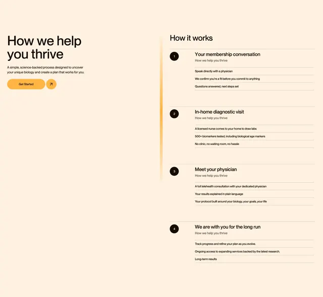
Light two-column process section with intro copy and CTAs on the left and a four-step numbered timeline on the right separated by a glowing orange vertical line.
Summary
A cream-background how-it-works section splitting an intro column with headline and CTAs from a four-step numbered process list, linked by a thin glowing orange vertical divider.
Visual description
Warm off-white background in two columns. Left column shows large bold headline "How we help you thrive", a short paragraph about a science-backed process, and an orange pill "Get Started" button plus circular orange arrow icon. Right column titled "How it works" lists four numbered steps, each with a black circle containing a white numeral, a bold step title, repeated grey sub-label "How we help you thrive", and three detail lines separated by thin horizontal rules. Steps cover membership conversation, in-home diagnostic visit, physician telehealth consult, and long-term support. A vertical orange line with a soft glow runs between the columns.
Key takeaway
The glowing vertical divider turns a plain two-column split into a visual timeline anchor. Repeating a short sub-label under every step title keeps rhythm while each step's detail lines carry the real information.
Reuse notes
Strong for membership or onboarding flows in healthcare, coaching, or any service with four clear phases. Text-heavy layout needs concise step titles and short detail lines. Works on light warm backgrounds with a single accent color for buttons and the divider.
More process sections
See all


More like this

Keep what you find
A free account saves references to boards and can send you a weekly email of picks based on what you save.
To see every result, go Pro.