Preview image. Unlock full-res
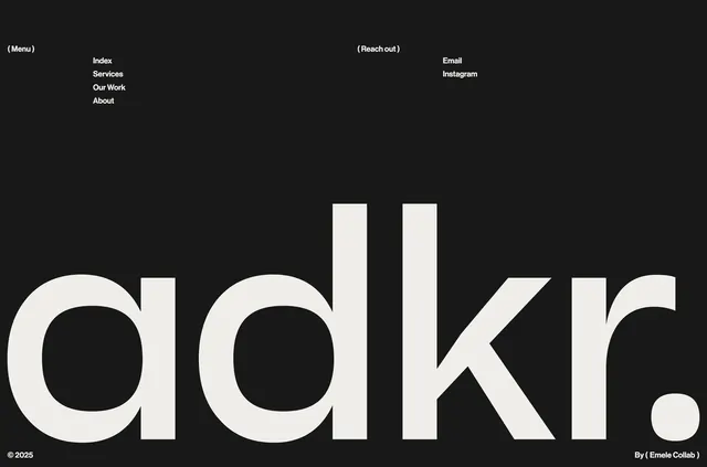
Dark minimalist footer with parenthetical link group labels, a massive "adkr." wordmark, and small copyright plus studio credit.
Summary
A three-tier dark footer pairing small parenthetical navigation groups with an oversized "adkr." wordmark and a slim copyright bar.
Visual description
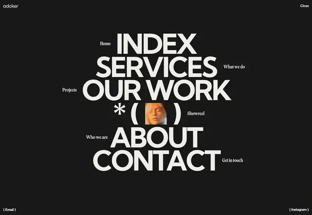
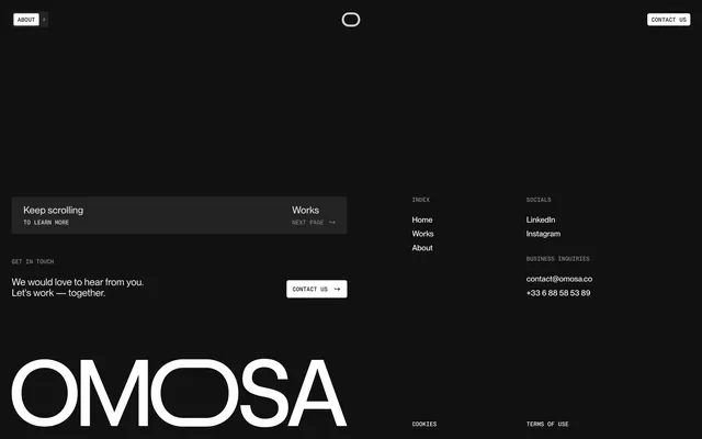
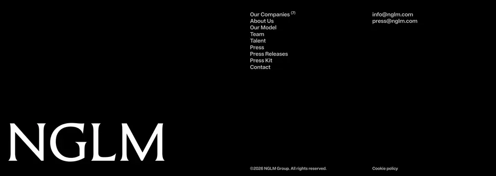
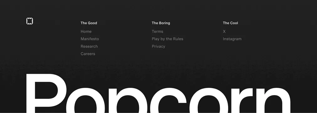
Deep charcoal or black background with off-white sans-serif text. Top area splits into two columns: left shows "( Menu )" above vertical links Index, Services, Our Work, About; right shows "( Reach out )" above Email and Instagram. Middle band is dominated by the brand wordmark "adkr." in extremely large bold sans-serif, nearly full width. Bottom edge holds "� 2025" left and "By ( Emele Collab )" right in small type. Parentheses recur as a typographic motif on section labels and credits.
Key takeaway
Using parentheses as functional labels "( Menu )" and "( Reach out )" adds personality without decorative graphics. Scaling the wordmark to footer hero size makes the closing moment memorable instead of an afterthought.
Reuse notes
Best for portfolio or agency sites that can afford a bold typographic close. The mega wordmark needs a short brand name; long names will not fit the same impact. Keep link count low to preserve airiness.