Preview image. Unlock full-res
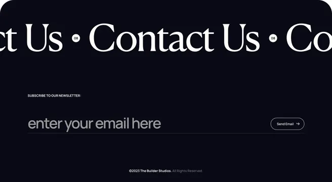
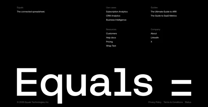
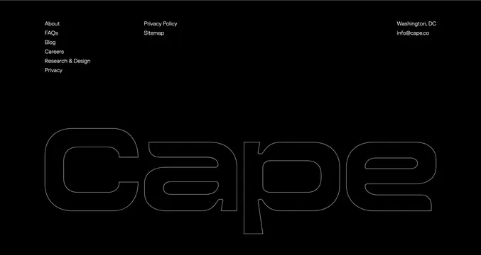
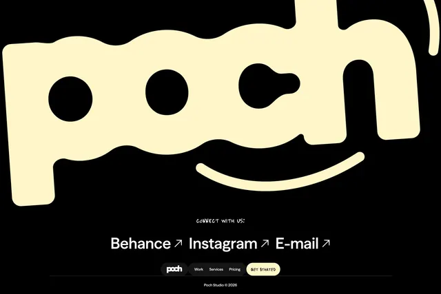
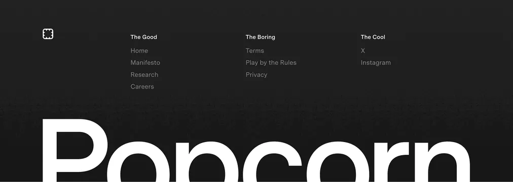
Grainy black footer with witty column headers, compact nav links, and an oversized cropped Popcorn wordmark.
Summary
A dark textured footer that labels link groups with personality ("The Good", "The Boring", "The Cool") above a massive partial wordmark.
Visual description
Charcoal black background with fine grain noise. Top row: small white rounded-square logo with four-petal icon left; three link columns with bold white headers and grey links. The Good lists Home, Manifesto, Research, Careers. The Boring covers Terms, Play by the Rules, Privacy. The Cool links X and Instagram. Bottom half dominated by enormous white "Popcorn" sans wordmark, cropped so only the upper portion is visible, creating a floor-to-typography effect.
Key takeaway
Renaming footer categories with brand voice makes legal links feel intentional. Oversized cropped logotype turns the footer into a brand stamp. Grain on black adds warmth without color.
Reuse notes
Works for consumer brands with strong naming and minimal link sets. Cropped mega-type needs vertical space; avoid on cramped mobile footers. Witty headers may not suit regulated enterprise sites.