Preview image. Unlock full-res
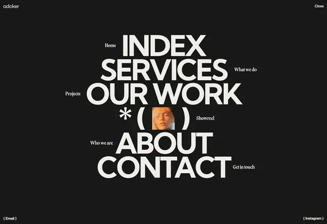
Full-screen dark navigation overlay with oversized stacked links, flanking serif descriptors, and a centered Showreel thumbnail row.
Summary
A fullscreen dark menu overlay with giant uppercase nav links, small serif context labels, and a Showreel row with an inset portrait thumbnail.
Visual description
Charcoal or black full-viewport overlay. Top left shows "adcker" in small lowercase sans; top right shows "Close". Center stacks large bold white uppercase links: INDEX with serif "Home" left, SERVICES with "What we do" right, OUR WORK with "Projects" left. Below OUR WORK sits a row with asterisk, open parenthesis, small warm-lit portrait thumbnail, close parenthesis, and serif "Showreel". Further down: ABOUT with "Who we are" left, CONTACT with "Get in touch" right. Bottom corners hold "( Email )" left and "( Instagram )" right in small type.
Key takeaway
Pairing each nav item with a whisper-sized descriptor ("What we do", "Get in touch") adds guidance without dropdowns. Reusing the parenthesis-framed Showreel thumbnail from the hero ties menu and homepage into one system.
Reuse notes
Strong pattern for agency sites that want menu moments to feel designed, not utilitarian. Works best with five or fewer primary links; more items will crowd the vertical stack. Requires a close control and smooth open/close behavior in production.