Preview image. Unlock full-res
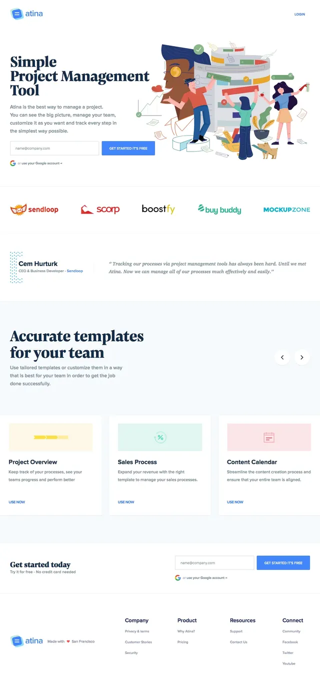
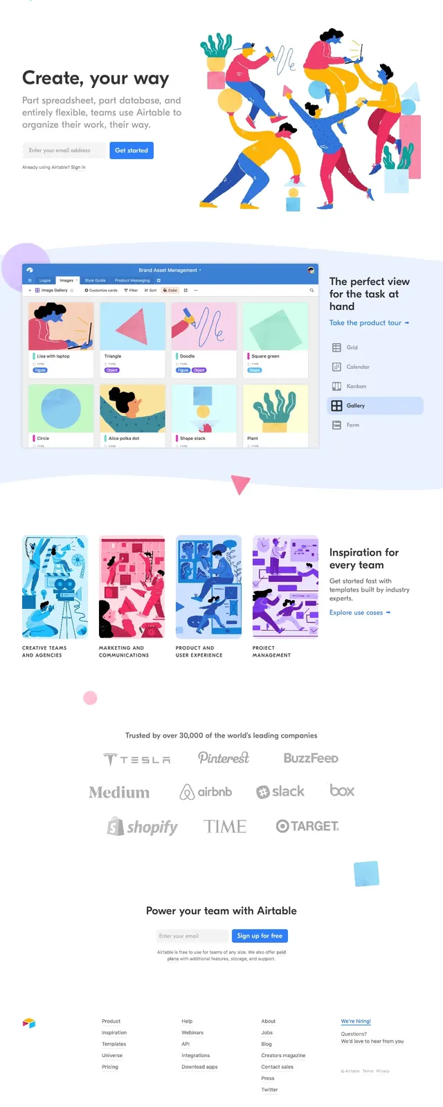
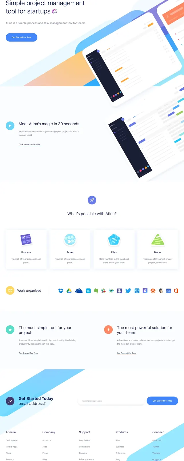
A clean, high-whitespace landing page for a collaborative documentation tool featuring playful illustrations and a structured flow.
Summary
A clean, high-whitespace landing page for a collaborative documentation tool featuring playful illustrations and a structured flow.
Visual description
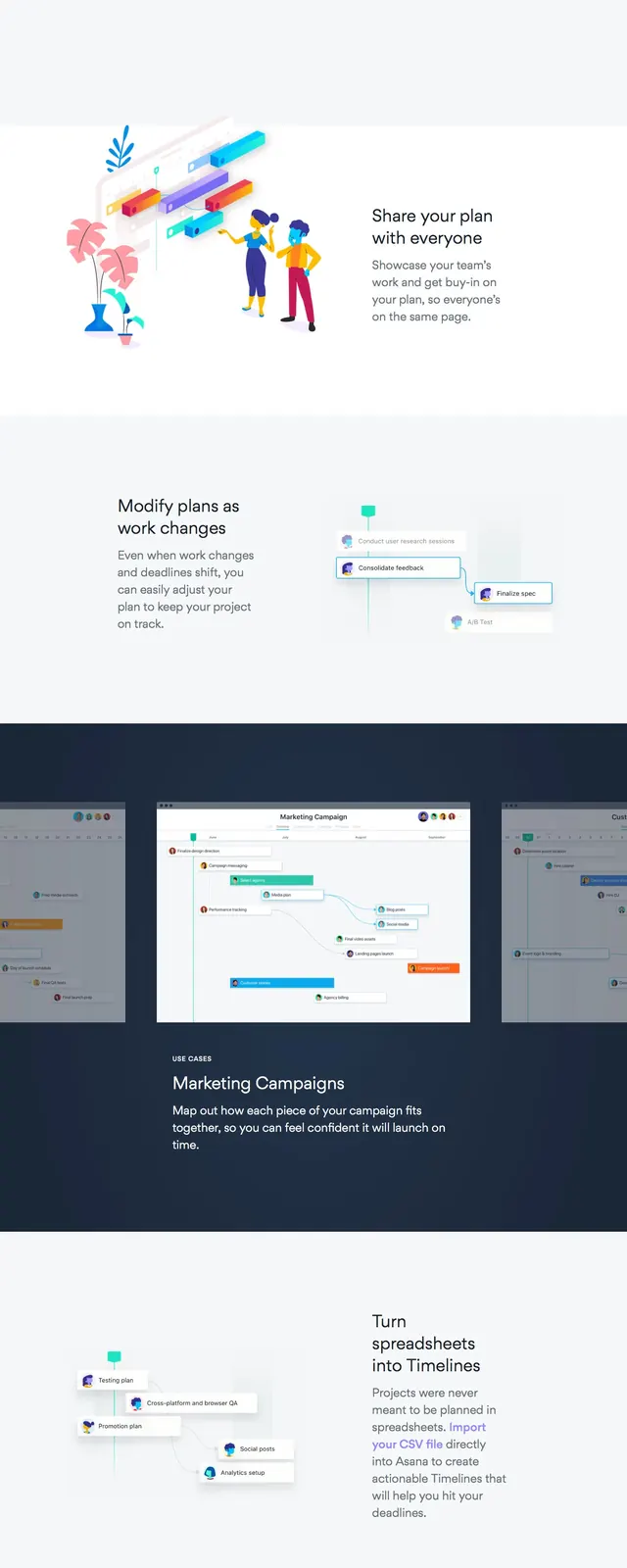
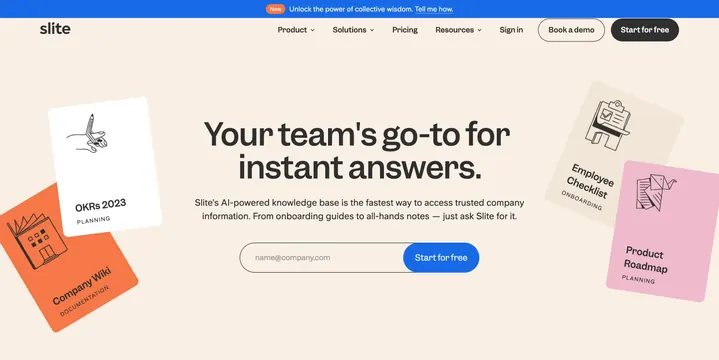
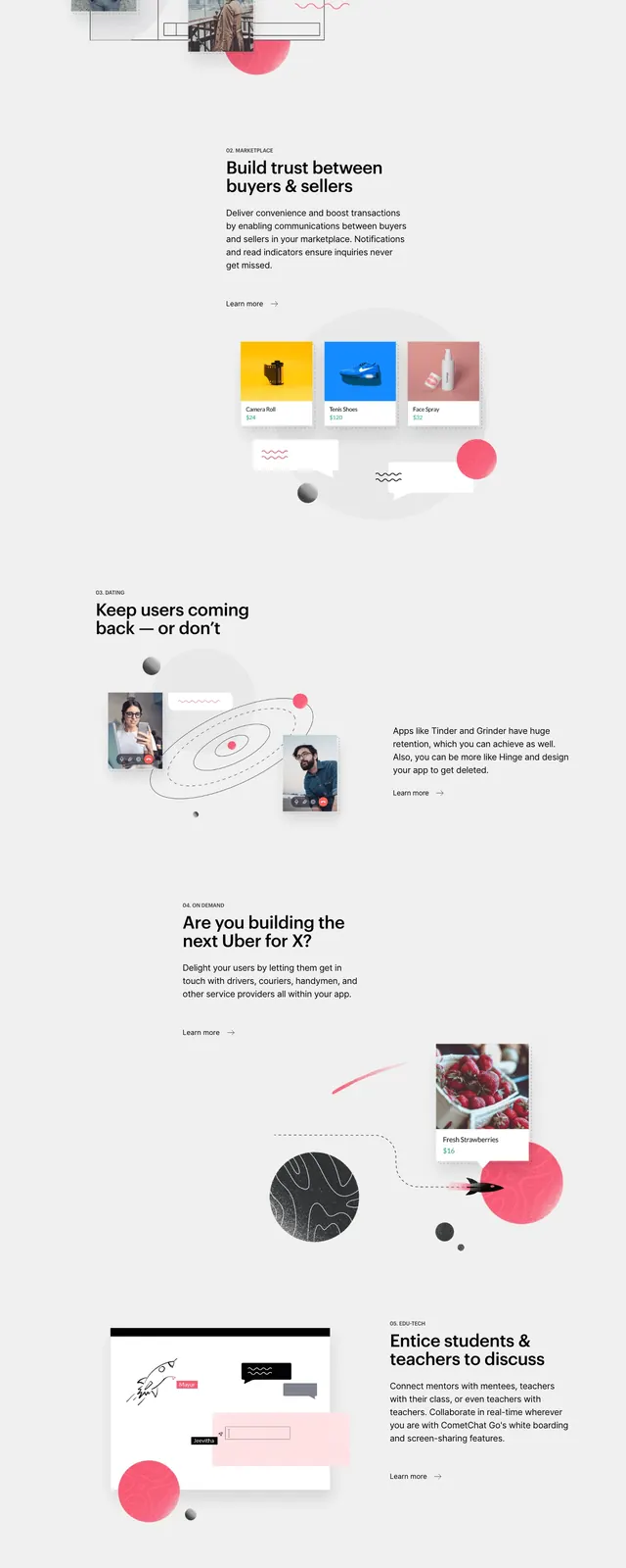
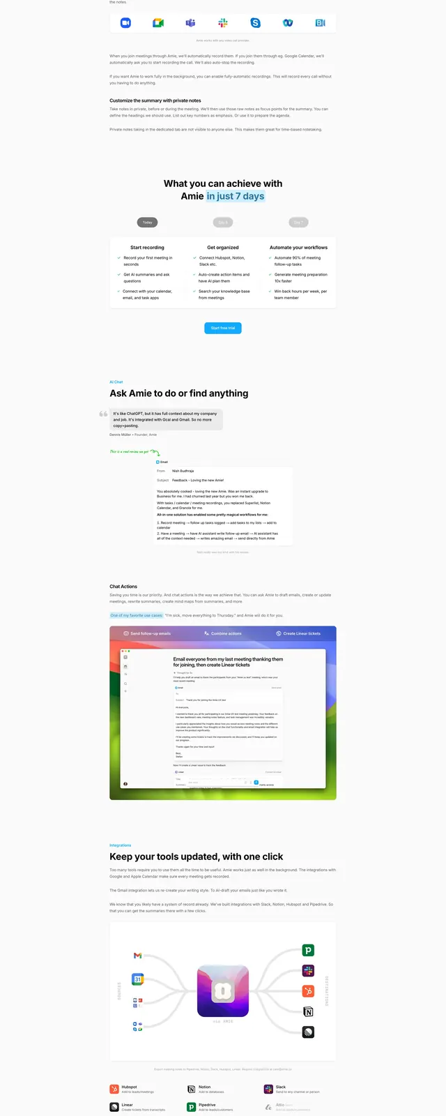
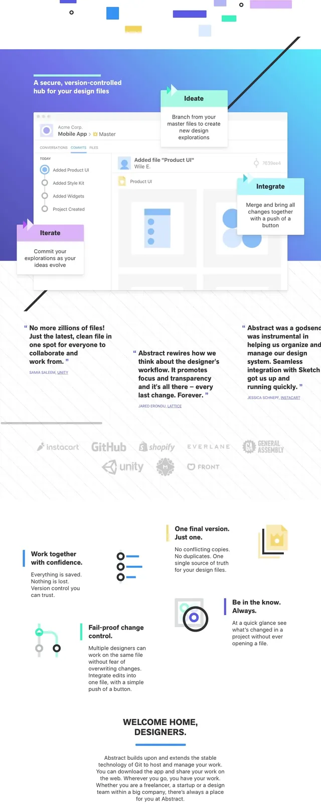
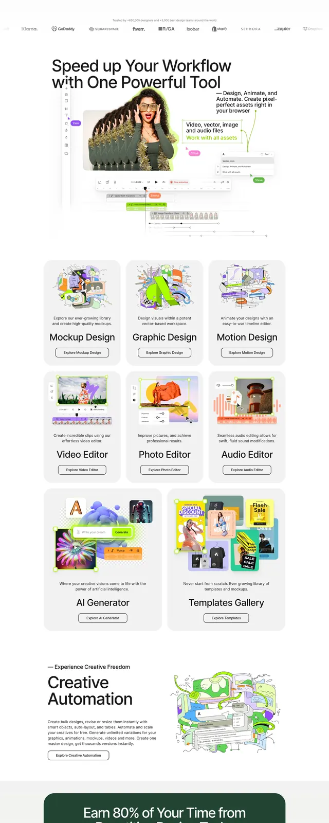
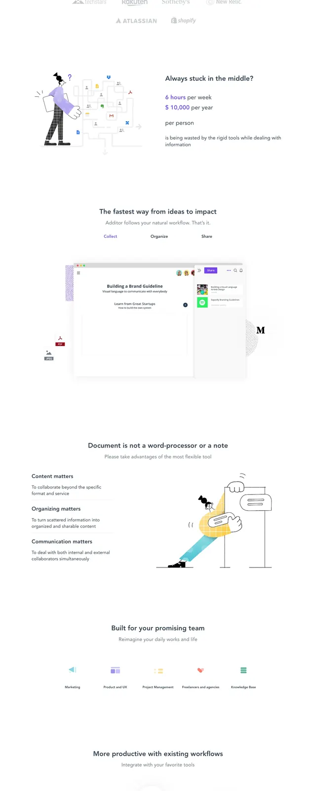
The page uses a stark white background with a strong blue primary accent color for buttons and branding. It features a mix of abstract 2D illustrations and a centered product UI mockup. The layout follows a traditional vertical stack with generous padding between sections.
Key takeaway
Effective use of negative space and a limited color palette creates a focused, uncluttered user experience.
Reuse notes
The alternating layout of text and illustrations is ideal for explaining complex software features in a digestible way.