Preview image. Unlock full-res
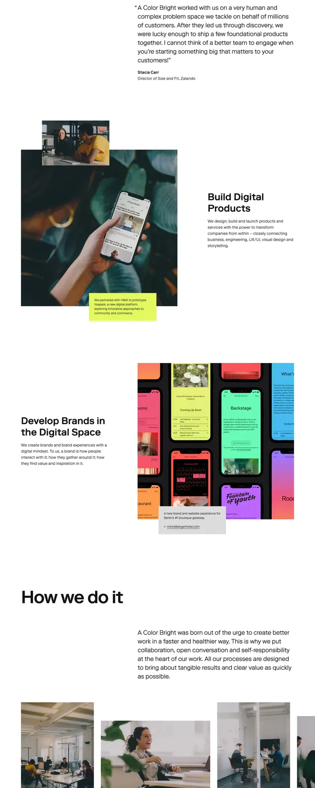
A professional training landing page for bartenders featuring high-contrast sections and bold typography.
Summary
A professional training landing page for bartenders featuring high-contrast sections and bold typography.
Visual description
The page uses a high-contrast color palette of white, bright orange, and deep charcoal. It features a circular portrait of a bartender in the hero section and overlapping mobile device mockups in the middle section. The footer is a clean dark-mode block with social icons and legal links.
Key takeaway
Effective use of alternating full-width color blocks to separate different value propositions and maintain user engagement.
Reuse notes
The split-layout hero with a circular image is a great way to humanize a professional service. The high-contrast orange accent color creates a strong visual hierarchy for CTAs.