Preview image. Unlock full-res
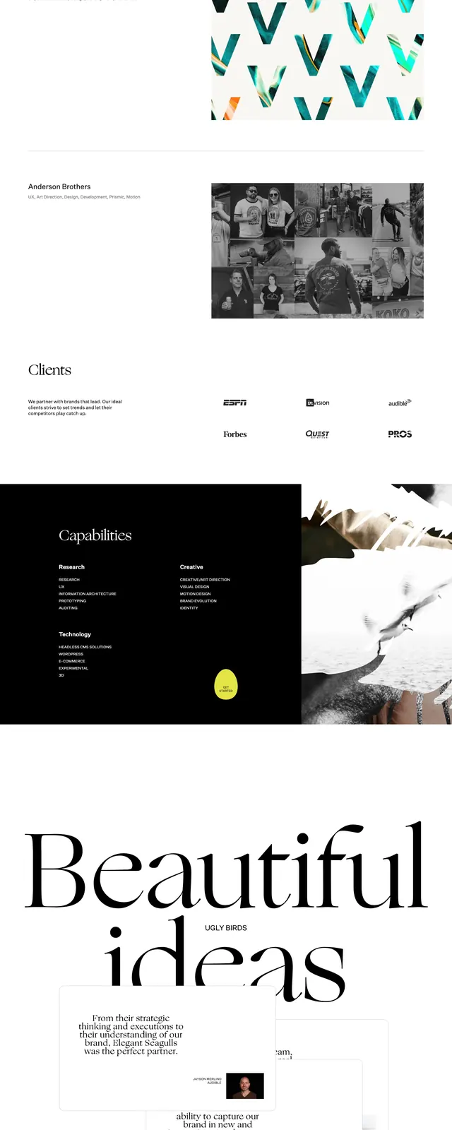
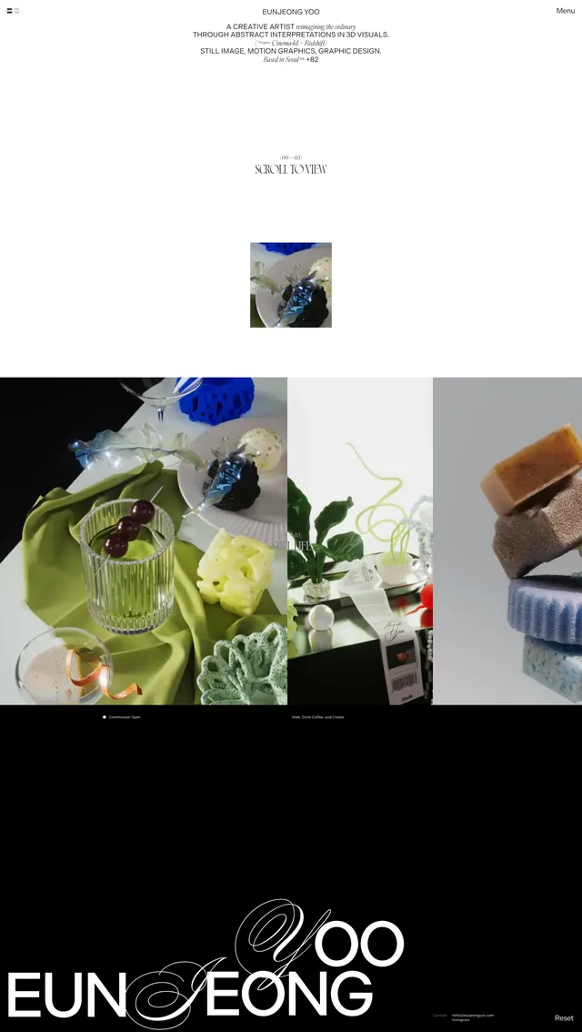
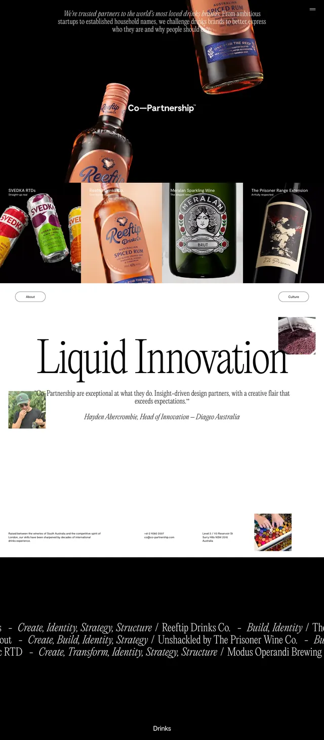
A high-contrast agency homepage combines a sparse white hero with a dramatic black content band and serif-led typography.
Summary
A high-contrast agency homepage combines a sparse white hero with a dramatic black content band and serif-led typography.
Visual description
The top section is a nearly empty white hero with a compact menu at left, a small logo at right, and a large serif headline reading across multiple lines. Below it, a full-width black band introduces oversized typography, a play button motif, and a short culture statement. Further down, three clean service columns and a centered call-to-action continue the minimalist editorial structure. The page ends with a restrained footer containing the brand mark, link lists, and a final contact prompt.
Key takeaway
The design relies on strong serif typography, lots of whitespace, and stark black-and-white contrast to feel premium and editorial. Its reusable pattern is a sparse hero followed by layered content blocks and a simple CTA.
Reuse notes
This works well for agency, studio, or consultancy homepages that want to feel refined without heavy visual decoration. Reuse the split light/dark rhythm and oversized serif headlines to create hierarchy fast.