Preview image. Unlock full-res
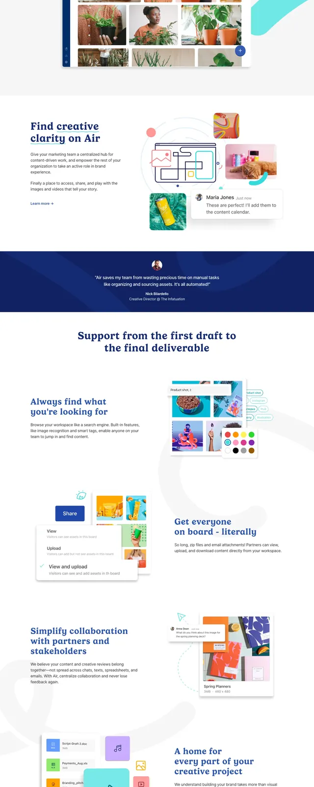
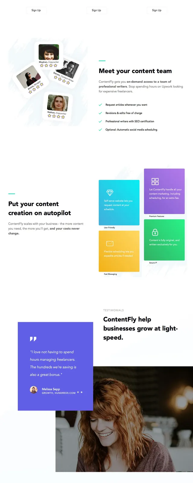
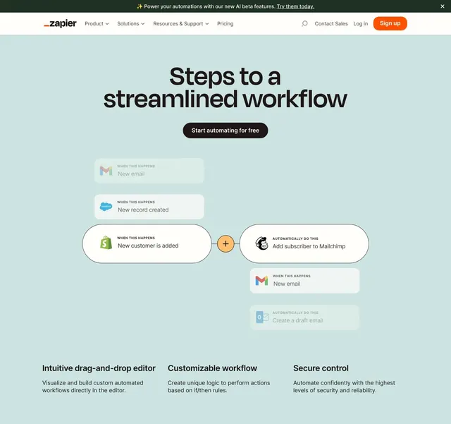
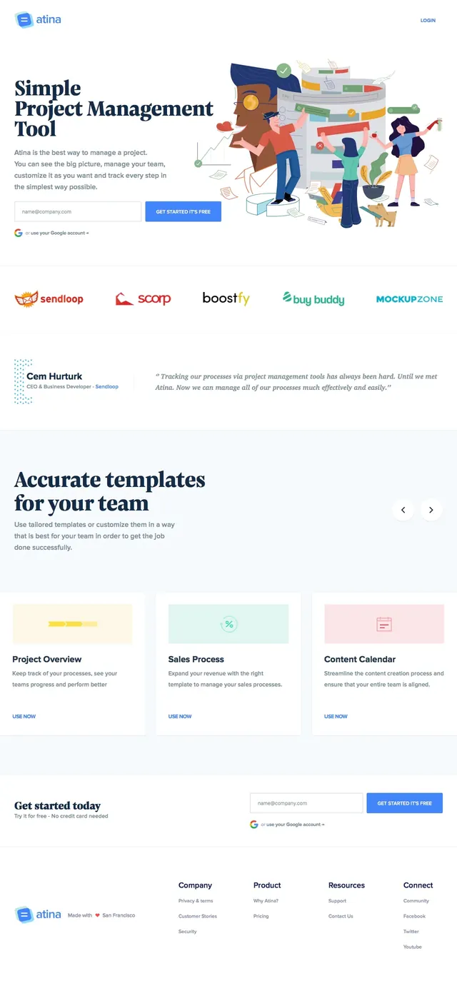
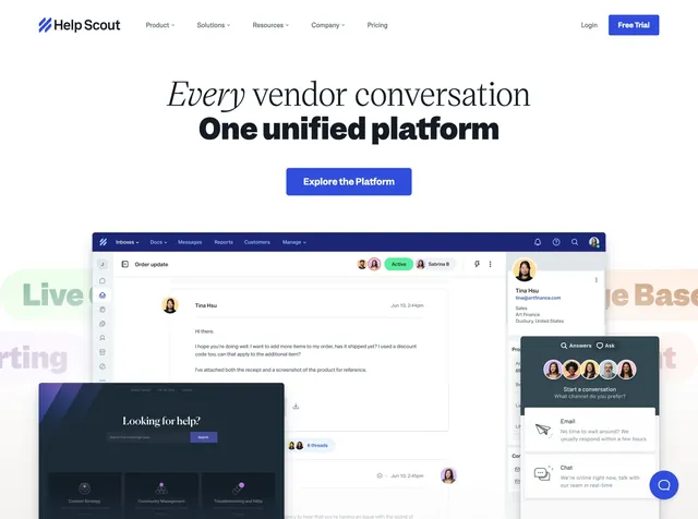
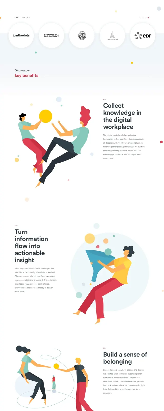
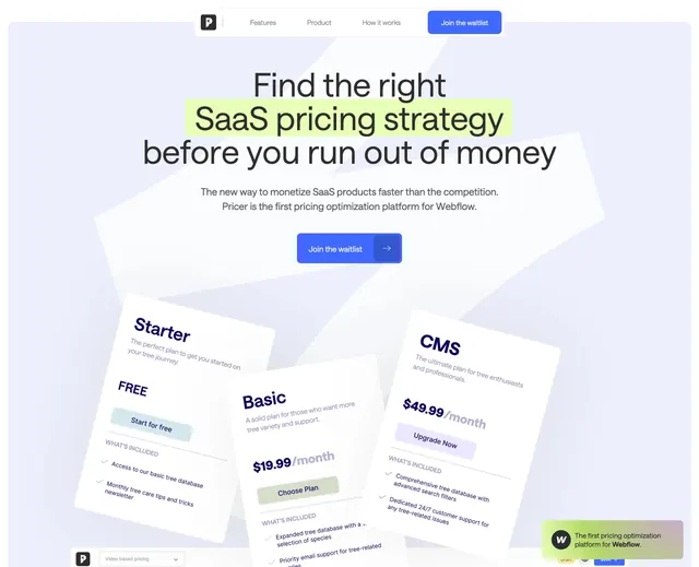
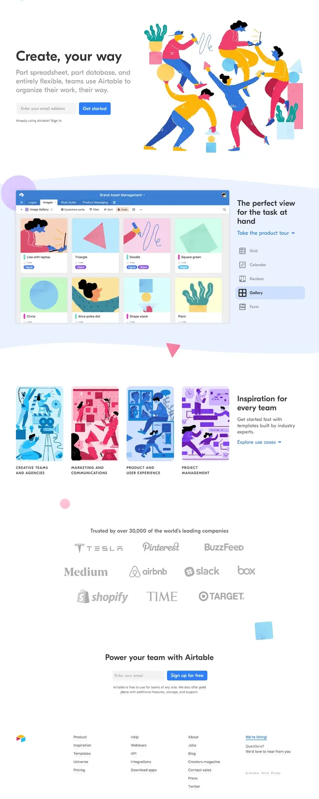
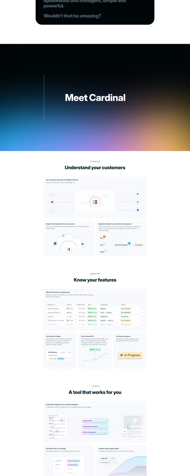
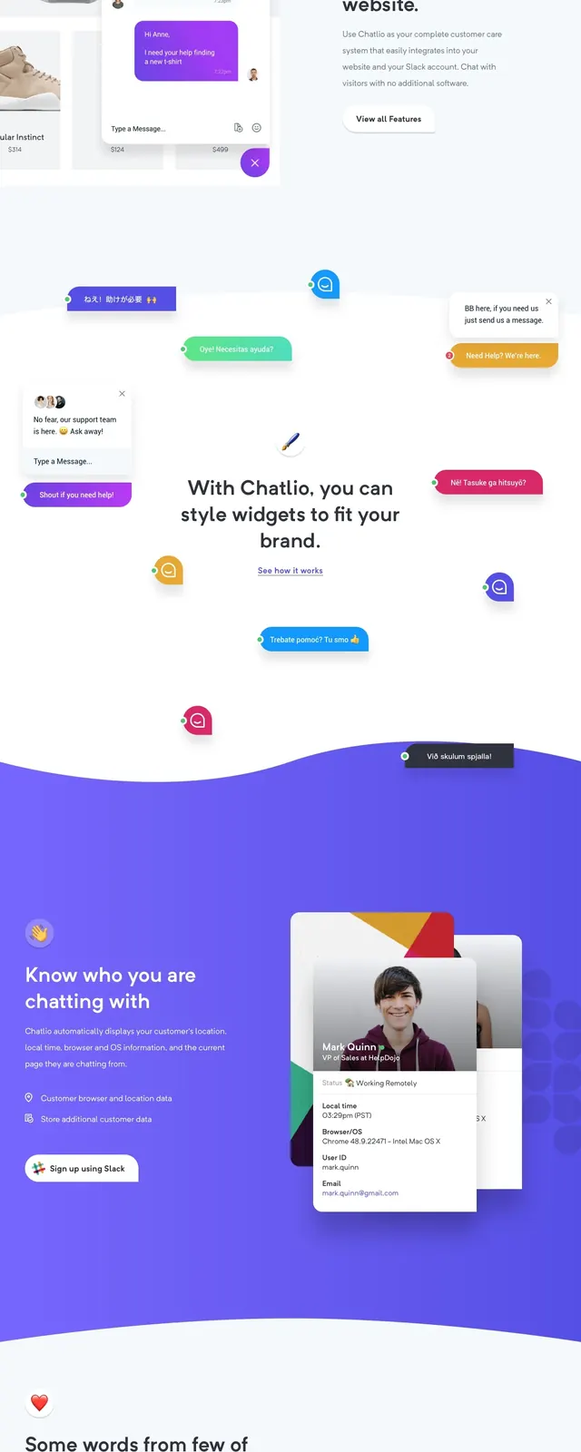
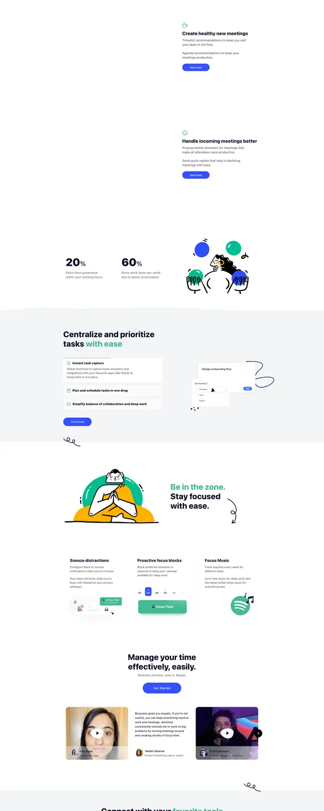
A clean, high-conversion SaaS landing page featuring a bright color palette and a mix of product previews and playful illustrations.
Summary
A clean, high-conversion SaaS landing page featuring a bright color palette and a mix of product previews and playful illustrations.
Visual description
The page opens with a bold hero section featuring a large headline and a detailed dashboard preview. It transitions into a grayscale logo cloud for social proof, followed by a statistics section with colorful 3D-style illustrations. The lower sections utilize a clean white background with a mix of feature lists and a blog grid.
Key takeaway
Effective use of whitespace and vibrant accent colors to balance professional software utility with an approachable, friendly brand personality.
Reuse notes
The layout of the 'Centralize and prioritize' section is a great example of a feature-benefit split with a supporting visual. The logo grid is a standard but effective way to build immediate trust.