Preview image. Unlock full-res
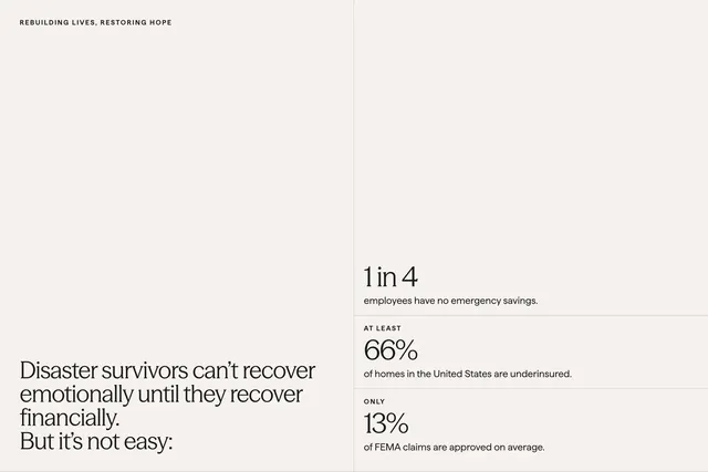
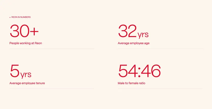
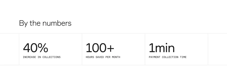
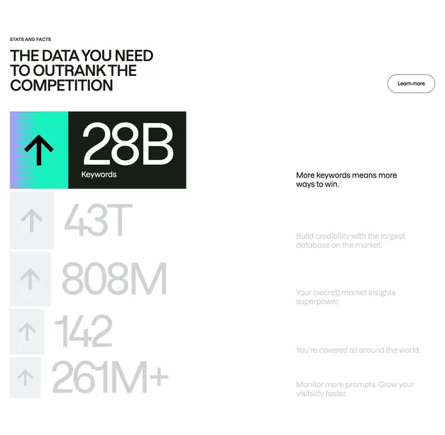
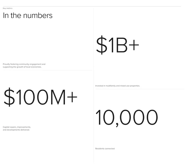
Minimal white stats section using thin grid lines to frame a headline block and three large financial and community metrics in an asymmetric 2x2 layout.
Summary
A monochrome stats block titled "In the numbers" that uses hairline grid dividers to separate intro copy from three oversized metrics about capital deployed, properties invested, and residents connected.
Visual description
Pure white field divided by thin light-grey horizontal and vertical rules into an asymmetric grid. Top-left cell holds a small "Key metrics" label, a large black heading "In the numbers", and a short grey paragraph about community engagement and local economies. Bottom-left shows "$100M+" in very large black type with a caption about capital repairs and developments. The right column splits vertically: top cell displays "$1B+" with copy about multifamily and mixed-use investment; bottom cell shows "10,000" with a line about residents connected. All numerals dominate their cells; captions sit small beneath. No icons, photos, or accent colors.
Key takeaway
Hairline grid lines turn a simple stats row into a Swiss-style composition without cards or backgrounds. Letting numbers scale to fill their cells creates impact with zero decoration. Pairing one narrative paragraph with raw figures balances story and proof.
Reuse notes
Ideal for institutional brands, funds, or platforms that need credibility through scale. Requires only three to four strong metrics; weak numbers will feel exposed. Best on light backgrounds with a single sans-serif family and consistent numeral sizing.