Preview image. Unlock full-res
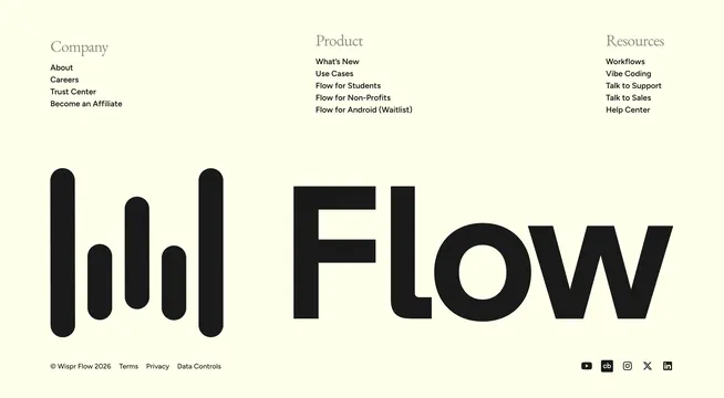
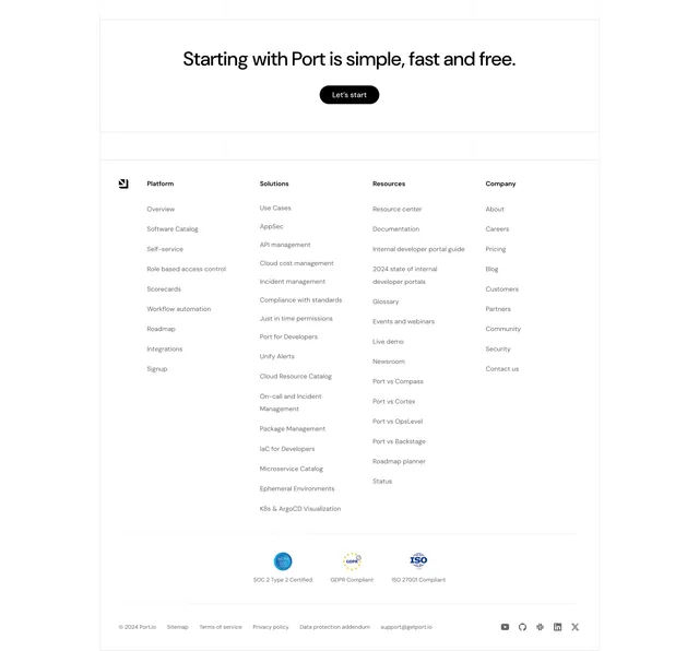
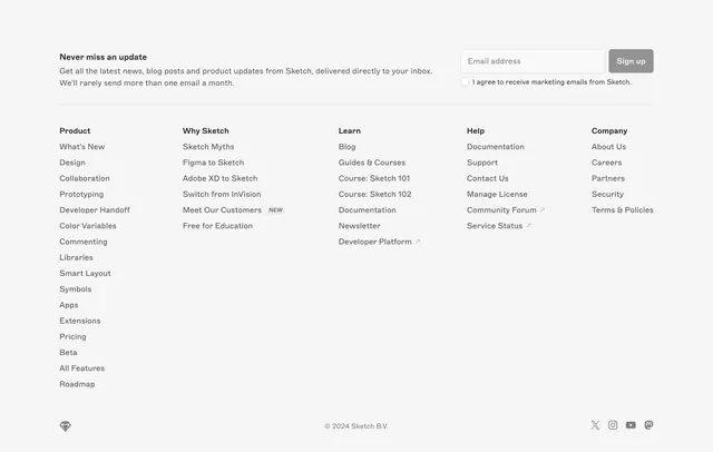
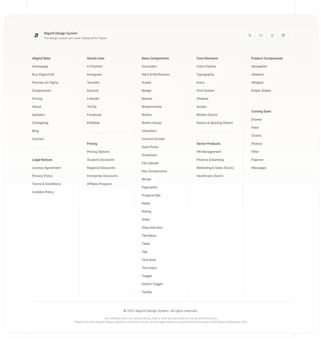
Light minimal footer with five-column sitemap listing every component, legal links, and social icons for a Figma design system.
Summary
A sprawling five-column footer that doubles as a full component catalog, with brand lockup, social icons, and legal fine print on a warm off-white canvas.
Visual description
Rounded off-white container on a light gray page. Top row: circular AlignUI logo with tagline left, four circular social icons (X, YouTube, Facebook, Dribbble) right. Five vertical columns separated by hairline dividers list Beta navigation, legal notices, social links, pricing tiers, base components (accordion through tooltip), core elements, sector products, product components, and coming-soon items. Bottom bar centers copyright and a small disclaimer about Figma affiliation and beta status in muted gray.
Key takeaway
Turning the footer into a searchable component index is smart for design-system sites where users hunt specific primitives. Hairline column dividers keep dense link lists readable without heavy borders.
Reuse notes
Best for design systems, UI kits, or documentation sites with large taxonomies. Requires disciplined link grouping; weak on mobile unless columns collapse to accordions.