Preview image. Unlock full-res
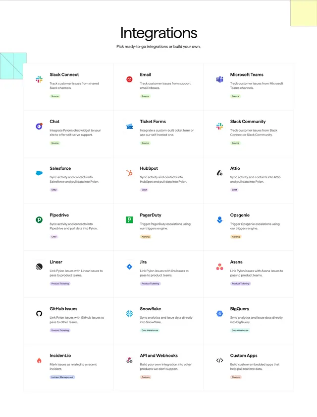
Integrations page with centered headline, 3x7 grid of integration cards with logos, descriptions, and color-coded category pills.
Summary
Integrations directory showing Pick ready-to-go integrations or build your own and twenty-one bordered cards grouped by Source, CRM, Alerting, Product Ticketing, Data Warehouse, Incident Management, and Custom tags.
Visual description
White page with light blue hatched square top left and pale yellow block top right. Centered Integrations headline and grey subtitle. Twenty-one equal white cards in three columns, each with partner logo top left, bold title, one-line description, and rounded category pill bottom left in green Source, purple CRM, orange Alerting, lavender Product Ticketing, teal Data Warehouse, blue-grey Incident Management, or brown Custom. Cards include Slack Connect, Email, Salesforce, Linear, Snowflake, API and Webhooks, and others through Custom Apps.
Key takeaway
Color-coded category pills let users scan integration type before reading copy. Uniform card anatomy scales to large catalogs without redesign. Corner geometric accents frame a dense grid without adding nav noise.
Reuse notes
Reference layout for integration index pages. Pill colors need a fixed legend for accessibility. Grid density assumes desktop; filter or search likely needed at scale beyond what is shown.
More integrations sections
See all





More like this

Keep what you find
A free account saves references to boards and can send you a weekly email of picks based on what you save.
To see every result, go Pro.