Preview image. Unlock full-res
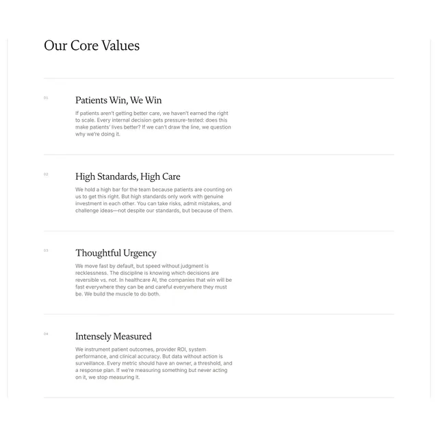
Light numbered list section presenting four company core values with serif titles, sans body copy, and thin horizontal dividers.
Summary
A monochrome "Our Core Values" block using a numbered vertical list where each value gets a serif title, supporting paragraph, and a full-width hairline divider.
Visual description
White background with a left-aligned serif section title "Our Core Values" at the top. Four stacked entries follow, each prefixed by a small light-grey sans-serif index (01 through 04). Each item opens with a bold serif value name ("Patients Win, We Win", "High Standards, High Care", "Thoughtful Urgency", "Intensely Measured") and a short sans-serif paragraph beneath. Thin light-grey horizontal rules separate every row, spanning the content width with generous vertical padding and no icons or imagery.
Key takeaway
Numbered indices in muted grey keep a long values list scannable without bullets or cards. Pairing one serif headline per item with plain body copy gives editorial weight on a purely typographic page. Hairline dividers do the structural work while staying nearly invisible.
Reuse notes
Works for mission-driven healthcare or B2B companies that want culture copy to feel serious, not playful. Needs four distinct, well-written values; thin dividers only read on white or very light backgrounds.