Preview image. Unlock full-res
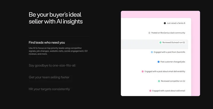
Dark feature section pairing a stacked tabbed text list on the left with a layered white card of colored buyer-signal pills on the right.
Summary
A dark feature block where a vertical list of expandable headings on the left controls a product mockup on the right showing a feed of colored "buyer signal" pills. The standout is the stacked white-on-pink card holding the signal list.
Visual description
Near-black background. Left column leads with an oversized two-line white headline ("Be your buyer's ideal seller with AI insights"), then a tabbed list of four headings divided by hairlines: the active one ("Find leads who need you") is white with a paragraph of grey supporting copy, while the others ("Say goodbye to one-size-fits-all," "Get your team selling faster," "Hit your targets consistently") are dimmed as collapsed rows. The right column shows a layered card: a soft pink panel sits behind a white card whose right-aligned list of rounded pills each pairs a small colored dot with a signal label ("Just raised a Series B," "Reviewed Outreach on G2," "Engaged with a post from ZoomInfo"). One row is highlighted with a light grey band.
Key takeaway
The vertical accordion of feature headings driving a single mockup is a compact way to show four features in one viewport. The colored-dot signal pills read as real product data and make the abstract idea concrete. Layering a pink panel behind the white card adds depth and a pop of brand color on the dark field.
Reuse notes
Strong for a product page where features map cleanly to one evolving visual. Needs a genuine product UI to populate the right card. The tabbed list implies interaction, so it suits a section meant to be clicked through; on dark backgrounds keep the accent pop (here pink) for the card only.