Preview image. Unlock full-res
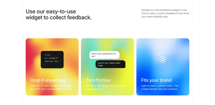
Audyr widget feature row with split headline and three gradient cards for embed code, chat UX, and theming.
Summary
A three-up Audyr feature block where each card uses a distinct warm-to-cool gradient to sell one widget benefit with a mini UI vignette.
Visual description
White section with a large left headline ("Use our easy-to-use widget to collect feedback.") and right-aligned gray body copy about one-line embed and existing tools. Three equal rounded cards below: orange-red-yellow gradient with a floating dark code snippet (audyr.js script tag); green-teal-yellow gradient with overlapping chat bubbles showing a conversational prompt and reply; blue gradient with a white sun icon for light/dark theming. Each card ends with a white bold title and short description.
Key takeaway
Assign each benefit its own gradient personality so a feature grid reads as three mini stories, not three identical boxes. Pair abstract marketing copy with a concrete UI fragment inside every card.
Reuse notes
Good for embeddable products where setup, UX, and customization are the main objections. Gradients need restraint in the card body so text stays legible.