Preview image. Unlock full-res
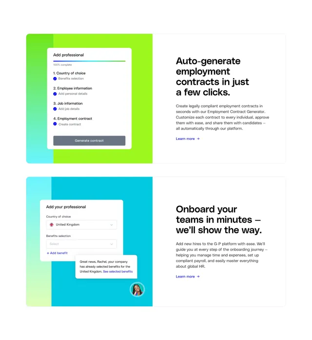
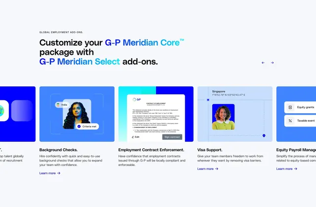
Horizontal carousel of gradient-backed add-on cards for G-P Meridian Select, each pairing a product UI vignette with title, copy, and learn-more link.
Summary
A modular add-ons row for G-P Meridian Core: oversized two-tone headline, carousel arrows, and blue-gradient cards each showing a mini product scene plus benefit copy.
Visual description
White section with small gray all-caps label "GLOBAL EMPLOYMENT ADD-ONS" top left. Large headline "Customize your G-P Meridian Core package with G-P Meridian Select add-ons." where "G-P Meridian Core" is navy and "G-P Meridian Select" is cyan. Circular prev/next arrow buttons top right. Below, a horizontal row of tall rounded cards on varied blue gradients, partially cropped at edges to imply scroll. Visible cards: Background Checks with employee portrait, India flag tag, and "Criteria met" badge; Employment Contract Enforcement with stylized contract UI and Edit/Sign buttons; Visa Support with portrait, Singapore coordinates, and map grid; partial Equity Payroll Management card with grant and taxable-event chips. Each full card has bold title, gray description, and blue "Learn more" link with arrow beneath the graphic.
Key takeaway
Color-coded gradient cards make distinct add-ons scannable while staying in one brand family. Mini UI vignettes inside each card explain abstract services faster than icons alone. Two-tone product names in the headline clarify base package vs upsell tier in one line.
Reuse notes
Strong for SaaS packaging pages selling optional modules on top of a core plan. Carousel needs enough cards to justify horizontal scroll. Each card requires a credible micro-mockup and a single benefit sentence.