Preview image. Unlock full-res
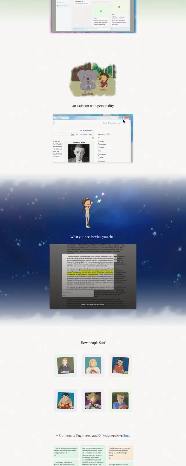
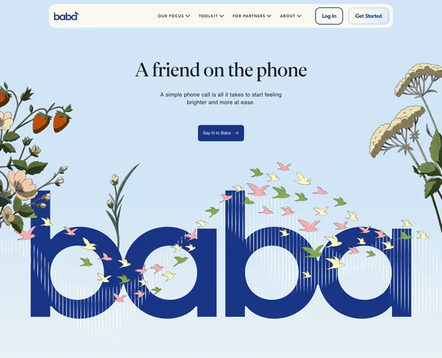
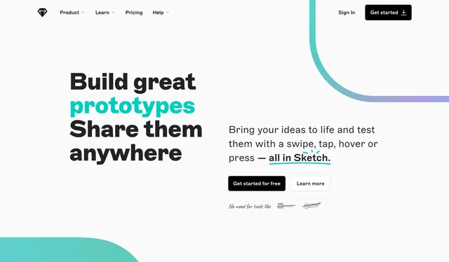
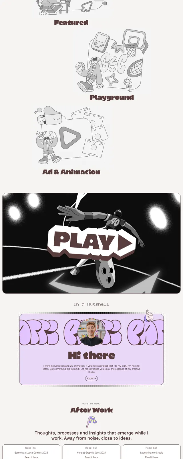
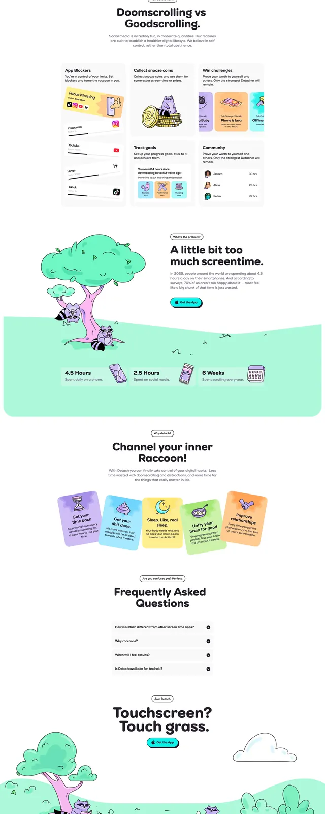
A whimsical consumer app landing page with a strong illustrated hero, bright mint-and-cyan accents, and stacked feature storytelling.
Summary
A whimsical consumer app landing page with a strong illustrated hero, bright mint-and-cyan accents, and stacked feature storytelling.
Visual description
The page opens with a split hero layout: a bold left-aligned headline, short supporting copy, and a prominent rounded CTA button, paired with a large illustrated smartphone scene on the right. The design uses soft white space, mint-green ground shapes, cyan glow effects, and cartoon raccoon characters to create a friendly, playful brand world. Below the hero are logo badges, a comparison-style feature section, stat callouts, illustrated benefit cards, and a soft green footer area that keeps the same hand-drawn style.
Key takeaway
This layout combines a standard conversion-focused landing page structure with highly distinctive illustration and color to make a productivity app feel approachable and memorable. The strongest pattern is the contrast between clean typography and whimsical characters, which keeps the interface usable while giving it personality.
Reuse notes
Reuse the hero structure for consumer apps that need immediate clarity plus a memorable visual hook. The illustrated mascot system, rounded CTA styling, and mint/cyan palette would translate well to wellbeing, habit, or productivity products.