Preview image. Unlock full-res
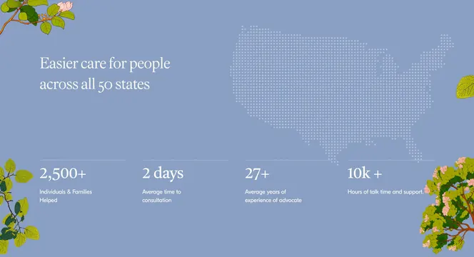
Periwinkle stats section with serif headline, dotted US map, four KPI counters, and botanical corner illustrations.
Summary
An impact band pairing a headline and dotted US map above four large white statistics with divider lines.
Visual description
Muted periwinkle background. Top-left white serif Easier care for people across all 50 states. Top-right large white dotted map silhouette of the United States. Bottom row four equal columns separated by thin white horizontal rules above each stat: large white serif numbers 2,500+, 2 days, 27+, 10k+ with smaller sans labels beneath. Pink-blossom branch illustrations in three corners.
Key takeaway
Dotted map visually reinforces nationwide claim beside headline instead of a separate map section. Four stats with top rules create rhythm without boxing each metric. Botanical corners humanize data density.
Reuse notes
Healthcare or social-impact brands proving scale. Map graphic must stay legible at mobile widths. Stat labels should stay to one line each.